
Paint Color Undertones Explained: Why Walls Shift
This post contains affiliate links. As an Amazon Associate, we earn from qualifying purchases.
Paint color undertones explained in one line: every color carries a mass tone (the overall color you see) and an undertone (the underlying hue that separates it from its neighbors). Warm colors lean orange, yellow, or red. Cool colors lean blue, green, or purple. Light and sheen decide which one actually shows on your wall.
Light and sheen are the two most common factors in how an interior color reads, per Polyvine’s technical guidance on color for paints and coatings. That’s why, with paint color undertones explained, the chip in the store aisle and the wall in your hallway can be the same paint and still look like strangers.
What follows: the two components of any color, the light tests that actually predict a wall, the primer code hiding on the back of the chip, and the one case where a touch-up turns into a full repaint.
Key Takeaways
- Mass tone is the color; undertone is the tell. Sherwin-Williams describes undertone as the underlying hue that separates a color from its neighbors in the same family.
- Sherwin-Williams holds that gray-tinted primer beats white or topcoat-tinted primer for bright, clean colors, and the shade is coded P1 (lightest) to P6 (darkest) on the back of a Sherwin-Williams chip, though conventional wisdom favors white or topcoat-tinted primer.
- Check the color under the light it will live in. Polyvine names light and sheen as the two most common factors in how interior paint reads.
- Deep, high-gloss shades don’t touch up cleanly. Polyvine notes a touch-up there can mean repainting the whole area.
- RGB values can’t choose a paint color. Sherwin-Williams states RGB data has no correlation to the liquid colorants used to tint paint.
What Are Mass Tone and Undertone, Exactly?
Sherwin-Williams splits every paint color into two parts, and the split is the whole game. The mass tone is the overall color of the chip. The undertone is the subtle underlying hue that distinguishes it from similar colors in the same family.
Mass tone is the overall color of a chip. Undertone is the underlying hue that separates one color from similar hues in the same family. Undertone intensity varies, and that variance changes how a painted room reads. Placing chips edge to edge exposes differences that a lone chip in a store aisle conceals.
With paint color undertones explained, undertones vary in intensity, and that variance is what makes two near-identical whites behave so differently once they cover a wall. A strong undertone announces itself. A weak one only shows up next to a neighbor.
Here’s the part that trips people up. A single chip is close to useless on its own. You need the comparison.
How to Spot an Undertone on a Chip
- Pull three chips from the same family, not three from different families. Sherwin-Williams uses Big Chill (blue/violet), Dover White (yellow), and Dreamy White (red) to show how three whites can sit in three different camps.
- Overlap the edges so the chips actually touch. Gaps hide the difference you’re hunting for.
- Take them home and look at them in your own room. Sherwin-Williams recommends obtaining chips and viewing them in your space rather than deciding at the counter.
Warm colors lean orange, yellow, or red. Cool colors lean blue, green, or purple. That’s the first filter, and it’s genuinely useful.
Easy to miss: A screenshot of a color is RGB data. Sherwin-Williams states plainly that RGB is not used to tint paint and has no correlation to the liquid colorants that go into a can.
If you want to go deeper on how hue, value, and chroma stack up, the color theory side of things covers the vocabulary. The short version for walls: undertone is the small variable with the big effect.
The Warm and Cool Split, and Where It Stops Helping
Warm colors lean orange, yellow, or red, and they give a room a cozy or energetic feel. Cool colors lean blue, green, or purple, and they read fresh and soothing. That’s the whole taxonomy, and it’s where most advice stops.
Where it gets thin is the next step. Sherwin-Williams points out that warm colors with yellow undertones complement oak floors and trim, and can act as neutrals against gray cabinets and a gray fireplace. That one sentence answers a large share of the “what goes with my floor” questions I get.
- Yellow-undertone warm colors are the safe pairing with oak, because the floor and the wall share a base note.
- Blue-undertone colors fight orange-toned wood, and the room reads cold at the edges.
- Greige sits in the middle and absorbs both directions, which is why it’s so forgiving.
If you’re weighing the two camps directly, the warm vs cool paint colors breakdown walks the light-by-light differences. And if you land in the middle, warm greige paint colors are where that middle lives.
Pick a dominant, a support, and one accent, then stop. Four colors on a wall you live with every day is already a crowd.
That’s my rule and I’ll defend it. A limited set forces the harmony that a big fan deck quietly prevents.
Why Your Wall Looks Different at 7 a.m. And 4 p.m.
You paint on a Saturday afternoon. By Monday morning the same wall reads colder, and by four o’clock it’s warm again. Nothing changed in the can.
Polyvine puts it directly: sunlight is the purest light and gives the purest color, but it changes as the day progresses. What may look great at 7 a.m. May look different at 4 p.m. Because of sunshine intensity and shadowing.
| Light source | What the sources report |
|---|---|
| Northern daylight | Emphasizes blue undertones (Sherwin-Williams) |
| Southern daylight | Colors appear softer (Sherwin-Williams) |
| D65 artificial daylight | Standard reference in manufacturer light boxes (Polyvine) |
| CIE Illuminant A (tungsten) | Standard reference for filament light (Polyvine) |
| TL84 fluorescent | Standard reference for fluorescent light (Polyvine) |
Natural Light and the Direction Your Room Faces
Direction matters more than most people expect. A north-facing room pulls the blue out of a color and makes it read cooler than the chip. A south-facing room softens everything it touches.
That’s the same paint, doing two different jobs in two rooms of one house.
Artificial Light: Bulb Type, Color, Temperature
Sherwin-Williams advises accounting for the bulb type, the bulb color, and the temperature when you judge a color under artificial light. Three variables, one lamp. Get any of them wrong and you’re evaluating a color that doesn’t exist in your house.
Polyvine goes further and names the standards manufacturers use for comparison: D65 artificial daylight, CIE Illuminant A tungsten filament light, and TL84 fluorescent light, held in light boxes that have to be well maintained. You don’t have a light box. You have a floor lamp and a window.
The practical version of that: judge the color at the hour you actually use the room. For more on this, how lighting changes paint colors is worth a read before you commit to a gallon.
The Primer Code on the Back of the Chip
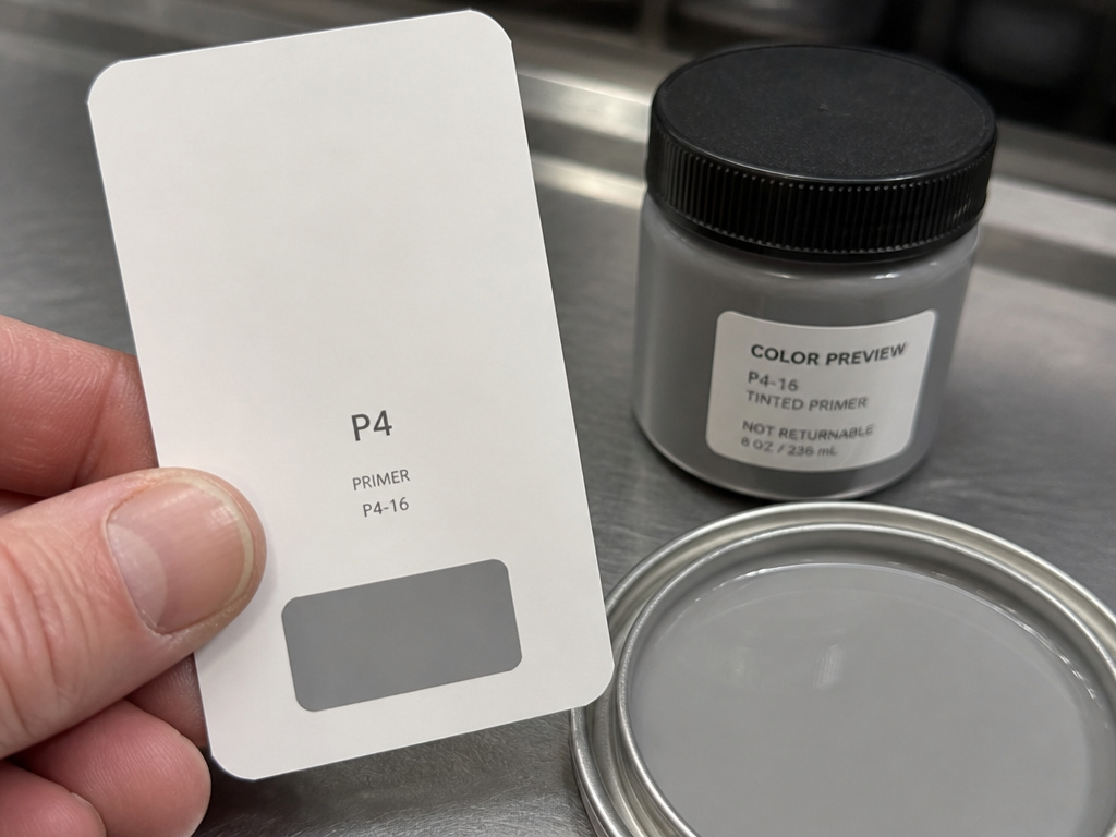
The first time I went from a dark navy wall to a pale one, it took several coats. Same wall, same roller, same technique. The paint wasn’t the problem.
With a gray-tinted primer, that job needs fewer coats. I ask the counter to tint the primer toward the topcoat color now, every time. Red walls under a pale topcoat were the other education, and the tinted primer saved me a lot of grumbling.
The reason is hide, and Sherwin-Williams explains it well. Any primary color that’s really clean tends to be more transparent. You get more hide when you add muted colorants like iron oxides or black. Muted, grayed-off, or duller colors simply cover better.
Which means the bright, clean color you love is the exact color that needs help underneath.
| Primer approach | Where it works | Where it costs you |
|---|---|---|
| White primer | Light topcoats over light walls | Bright, clean colors still need extra coats |
| Primer tinted to the topcoat color | Small shifts within one color family | Clean primaries stay transparent and thin |
| Gray-tinted primer (P1-P6) | Bold, vivid, and clean colors | You have to read the code on the chip back |
Conventional wisdom says white primer, or primer tinted with the topcoat color, while Sherwin-Williams argues against both. Sherwin-Williams holds that primer tinted to the right shade of gray creates the ideal balance of light absorption and reflection, giving superior hide over white or topcoat-tinted primer, though conventional wisdom favors white or topcoat-tinted primer. Sherwin-Williams holds that bold, vivid hues reach their true color in fewer coats over a gray-tinted basecoat, while conventional wisdom favors white or topcoat-tinted primer.
What P1 Through P6 Mean
Sherwin-Williams runs the Color Prime System, which includes six gray shades for tinting primers, matched scientifically to optimize color. The code is printed where you’d never look: on the back of the color chip.
P1 is the lightest gray. P6 is the darkest. If a gray-shade primer is recommended for that color, the chip back tells you which one to ask for.
Common mistake: Assuming a one-coat paint will cover a clean, bright color. Sherwin-Williams notes that some colors can cover in one coat but many can’t, and that palettes built for one-coat hide generally aren’t bright and clean, while bright, clean colors need a gray-tinted basecoat to reach true color in fewer coats. You’ll be back at the counter for a second gallon.
Why Two Cans of the Same Color Don’t Match
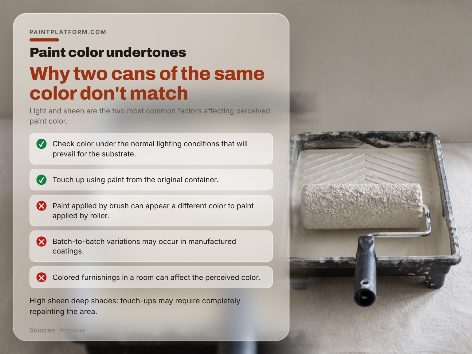
Polyvine lists the causes of a color mismatch on a finished wall, and the list is longer than most people expect: different substrate, film thickness, gloss level, angle of viewing, film smoothness, application and drying method, application conditions, and lighting type.
- Batch variation happens even in industrially manufactured coatings.
- Application method matters more than anyone wants to hear. Paint applied by brush can appear a different color than paint applied by roller.
- The room itself shifts the read. Colored furnishings affect perceived color.
- Sheen changes everything, and it’s one of the top two factors alongside light.
I stopped judging a color from the roller tray years ago. The tray tells you what the paint looks like wet, which is not the question.
Metamerism, in Plain Terms
Apparently similar colors formulated with different colorants can look very different under different lighting. That’s metamerism, and it’s the reason a color that matched in the store can betray you at home.
Polyvine’s fix is specific. Use the same choice and combination of colorants as the original color where possible, and no more than four colorants.
So the Room Looks Wrong. Now What?
Here’s where the two sources genuinely part ways, and it’s worth knowing both before you spend anything.
Sherwin-Williams suggests that if you’ve already painted a room and dislike the color, try changing the lightbulbs. It could make all the difference. Polyvine’s position is that color should be checked in the normal lighting conditions that will prevail for that surface, meaning you verify the light before you commit rather than swapping bulbs afterward.
Both are right about the mechanism. They disagree about timing. If the wall is already painted, Sherwin-Williams suggests the bulb swap as the cheaper experiment, while Polyvine’s position is to verify the light before committing rather than swapping bulbs afterward. If you haven’t bought paint yet, Polyvine’s position is to test under the real light first, while Sherwin-Williams suggests changing bulbs as a fix if the color still reads wrong.
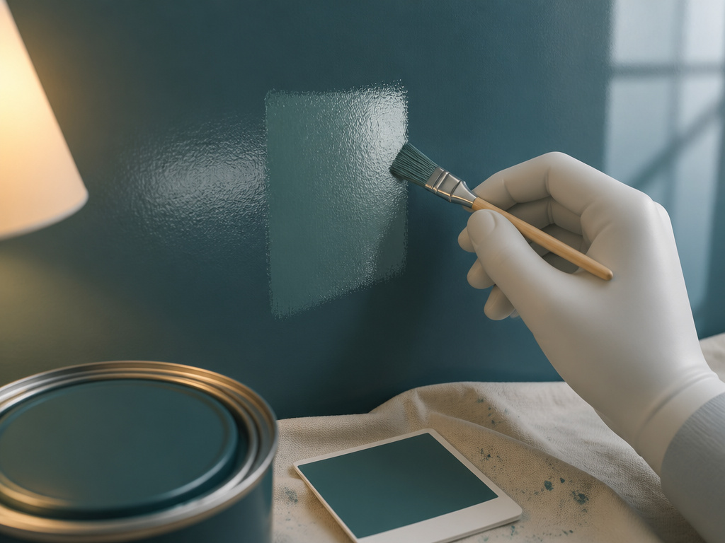
Then there’s touch-up, where Polyvine contradicts itself in a useful way. Polyvine advises that touch-ups should always use paint from the original container, though it also warns that high-sheen deep shades may require a full repaint. Polyvine advises touch-ups should always use paint from the original container, but also warns that color differences are most noticeable with high sheen and deeper shades, so a touch-up there could require completely repainting the area rather than just touching it up.
Worth knowing before you start: A touch-up on a deep, high-gloss color can turn into a full repaint of that wall. The patch reads as its own rectangle the moment the light hits it, and no amount of blending fixes a sheen mismatch.
Chasing the fix is where the how to choose paint colors for a room process should have started. And if you haven’t painted yet, testing paint colors on a board you can move around the room beats any chip decision made standing up.
One more thing worth saying: Sherwin-Williams notes that a chip comparison helps you spot undertones, while Polyvine’s list of variables means chip appearance doesn’t fully predict the wall. Substrate, thickness, gloss, angle, and application all get a vote. Sherwin-Williams treats chip comparison as a way to spot undertone differences, while Polyvine’s variables mean the chip narrows rather than decides.
Frequently Asked Questions
What’s the difference between mass tone and undertone?
Mass tone is the overall color of the chip, the thing you’d name if someone asked. Undertone is the underlying hue that separates it from similar colors in the same family. Two whites can share a mass tone and still land in completely different camps once an undertone is involved.
Does a north-facing room really change my paint color?
It emphasizes blue undertones, according to Sherwin-Williams. Southern light does the opposite and makes colors appear softer. The paint is identical. The room is doing the work.
Can I match a paint color from a photo on my phone?
No. Sherwin-Williams states that RGB data is used to create colors on video screens and has no correlation to the liquid colorants used to tint paint. A phone screenshot is a screen color, not a paint formula.
Why did my touch-up look worse than the original wall?
Polyvine advises using paint from the original container, but also warns that color differences are most noticeable with high sheen and deeper shades, so a touch-up there could require completely repainting the area. On a deep gloss finish, the touch-up may need to become a full repaint of that area.
Do I need gray-tinted primer for every color?
No. Sherwin-Williams positions the Color Prime System as the way to get the best hide for bright, clean colors specifically, though conventional wisdom favors white or topcoat-tinted primer. Sherwin-Williams notes that muted and grayed-off colors already hide well on their own, while conventional wisdom favors white or topcoat-tinted primer.
Why do two cans of the same color look different on the wall?
Batch-to-batch variation is possible even in factory-made coatings, and Polyvine lists substrate, film thickness, gloss level, viewing angle, application method, and lighting type as additional causes. Same label, different result, and the label isn’t lying.
The Bottom Line
If the room is already painted and you hate it, Sherwin-Williams suggests swapping the bulbs before you buy a gallon, while Polyvine’s position is to check color under the normal lighting that will prevail before committing. That’s the cheapest test available, and Sherwin-Williams holds that it can make all the difference, while Polyvine’s position is to verify the light before committing.
If you haven’t painted yet, do the opposite. Polyvine’s position is to test under the light that will actually live in that room, at the hour you actually use it, while Sherwin-Williams suggests changing bulbs as a fix if the color still reads wrong.
One concession, because it matters: everything above assumes you’re choosing between colors that are close. If you’re going from a dark navy to a pale cream, Sherwin-Williams argues the color conversation is secondary to getting a gray-tinted primer right, though conventional wisdom favors white or topcoat-tinted primer. Sherwin-Williams’ position is to get the gray-tinted primer right and read the P-code so the topcoats behave, while conventional wisdom favors white or topcoat-tinted primer.
Here’s the quick version. Grab three chips from the same family, tape them to a piece of board so the edges touch, and carry that board to your north window, then your south one. Watch the undertone move. You’ll learn more from that quick comparison than from scrolling color-of-the-year announcements, which push trends more than they help anyone choose.
