
Color Theory for Painters: Triads That Work
This post contains affiliate links. As an Amazon Associate, we earn from qualifying purchases.
Color theory for painters gets simpler when you stop buying 48-pan sets and start with a small triad plus white. A peer-reviewed study applied the Kubelka-Munk model to a five-paint Winsor & Newton oil palette and hit an average error of 1.49 Delta E00 across 33 mixes. That tight palette goes further than a big one.
A 1.49 Delta E00 error sits inside the 0.0 to 5.0 range ASTM D2244-23 calls the sweet spot for Delta E00, so the color theory for painters question is settled: a five-paint palette matches a bigger one on paper. The catch is that the model assumes opaque, alla prima paint. Thin washes, glazes, and metallic films fall outside it entirely.
What follows is the practical version of that research: how to build a triad you’ll actually use, what Delta E00 and ASTM D2244 measure, where metamerism bites, and where the standards themselves disagree. No formulas to memorize. Just the pieces you can test on a scrap of paper this afternoon.
Key Takeaways
- Three colors plus white beat a large pan set for learning, because every mix you make teaches you something the next mix uses.
- Delta E00 is the recommended unit for small color differences in the 0.0 to 5.0 range, per ASTM D2244-23.
- Metamerism is a lighting problem, not a paint problem. Two colors that match under daylight can clash under tungsten.
- Most colors need three colorants or fewer, plus white (Benjamin Moore), and Polyvine caps it at four to reduce metamerism.
- Mixing charts belong in the sketchbook, not on a wall you’ll forget to look at.
Why Does a Five-Paint Palette Beat a 48-Pan Set?
Because every mix on a small palette teaches you something the next mix uses. A large pan set gives you colors you don’t know how to combine. A five-paint palette gives you combinations you’ve actually tested, and a peer-reviewed study hit 1.49 Delta E00 average error across 33 mixes with exactly that approach.
The Kubelka-Munk model predicts the color of a paint mix from the absorption and scattering spectra of its base paints. Applied to five Winsor & Newton oil paints in an opaque alla prima method, it produced an average error of 1.49 Delta E00 across 33 mixes, confirmed by holdout cross-validation.
For years I squeezed paint straight from the tube and applied it unmixed, thinking that was how painters worked. Learning to mix even two colors gave me softer, more believable results. The palette got smaller. That was the color theory for painters point.
The 5-paint result isn’t a fluke of one study. The full-gamut sampling technique the researchers proposed is built to keep mixed colors minimal in quantity and well-distributed across the gamut the base paints can reach. That’s the same principle behind a mixing chart in your sketchbook: cover the range, don’t cover the page.
The Kubelka-Munk Model, Explained Without the Math
Kubelka-Munk is a way of predicting what a mix will look like before you mix it. The model treats paint as a thin, permeable layer and calculates how light gets absorbed and scattered as it passes through. Give it the spectra of your base paints, and it predicts the color of any combination.
The Kubelka-Munk oil colour mixing model has been applied to real oil paint with measurable accuracy: 1.49 Delta E00 average error across 33 mixes on five Winsor & Newton paints.
Here’s the part that surprised me. The study tested whether correcting for different oil absorptions and mass densities of the base paints improved the prediction. It didn’t. Raw base-paint mass worked just as well as the physically correct refinement. Sometimes the simple version wins.
For the industrial side of color formulation, the American Chemical Society publishes a Color Formulation and Control chapter that’s worth knowing about.
Three things the model needs from you:
- The reflectance spectra of each base paint
- The mass-based concentration of each paint in the mix
- An opaque application method (alla prima works; glazes don’t)
Why the Model Breaks on Washes and Glazes
Kubelka-Munk assumes opaque, alla prima paint. The moment you thin paint into a wash or build it in translucent glazes, the model’s assumptions stop holding. The palette still works. The predictions just get less reliable, and you’re back to testing on paper.
What Do Delta E00 and ASTM D2244 Actually Measure?
The 0.0 to 5.0 Delta E*ab range is where Delta E00 is recommended, per ASTM D2244-23. That’s the range where small color differences actually matter to the eye. The smaller the number, the closer the match.
The ASTM D2244 color tolerance standard says Delta E00 is highly recommended for differences in that range. It also warns that color-difference equations are optimized for daylight. Under other illuminants, the correlation with visual judgment may not hold. That’s where metamerism checks come in.
Two practical takeaways from the standard:
- Use Delta E00 for small differences (0.0 to 5.0 range)
- Check metamerism under non-daylight illuminants per Practice D4086
How to Build a Warm-and-Cool Triad You’ll Actually Use
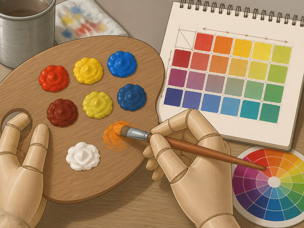
Start with one warm and one cool version of each primary. That’s six colors, and no, you don’t need all six to start. Pick the three that match your subject and add the others as you notice the gap.
A color wheel helps you see which direction each primary leans, but treat it as a reference, not a rulebook. The distinction between warm and cool colors is more useful than the wheel itself, because temperature is what makes a mix feel right or wrong on the page.
- Pick a warm and cool red. Cadmium red leans orange; alizarin leans purple. Test both against white.
- Do the same for yellow and blue. Cadmium yellow is warm; lemon yellow is cool. Ultramarine is warm; phthalo is cool.
- Mix a chart of every pair you own. Two colors per square, plus white. Keep it in the sketchbook.
- Label each square with the ratio. “2:1 red to yellow” is more useful than “orange.”
The mixing paint colors process gets easier once the chart exists, because you stop guessing. If you’re painting figures, skin tones are where the warm and cool distinction earns its keep.
Common mistake: Mixing too many pigments at once. Past a few colors in a single mix, every addition mutes the result toward gray. The mud problem is a pigment-count problem, not a skill problem.
The Three-Tube Starter (and Why It Works)
Three tubes plus white is enough to learn mixing. Student-grade tubes hold up for learning the basics. You don’t need artist-grade pigments to learn what a warm and cool version of each primary does.
Mixing Charts Belong in the Sketchbook
Keep your charts in the sketchbook, not on a wall. A wall chart becomes decoration. A sketchbook chart gets flipped open every time you mix.
Where Color Matching Breaks: Metamerism, Sheen, and Substrate
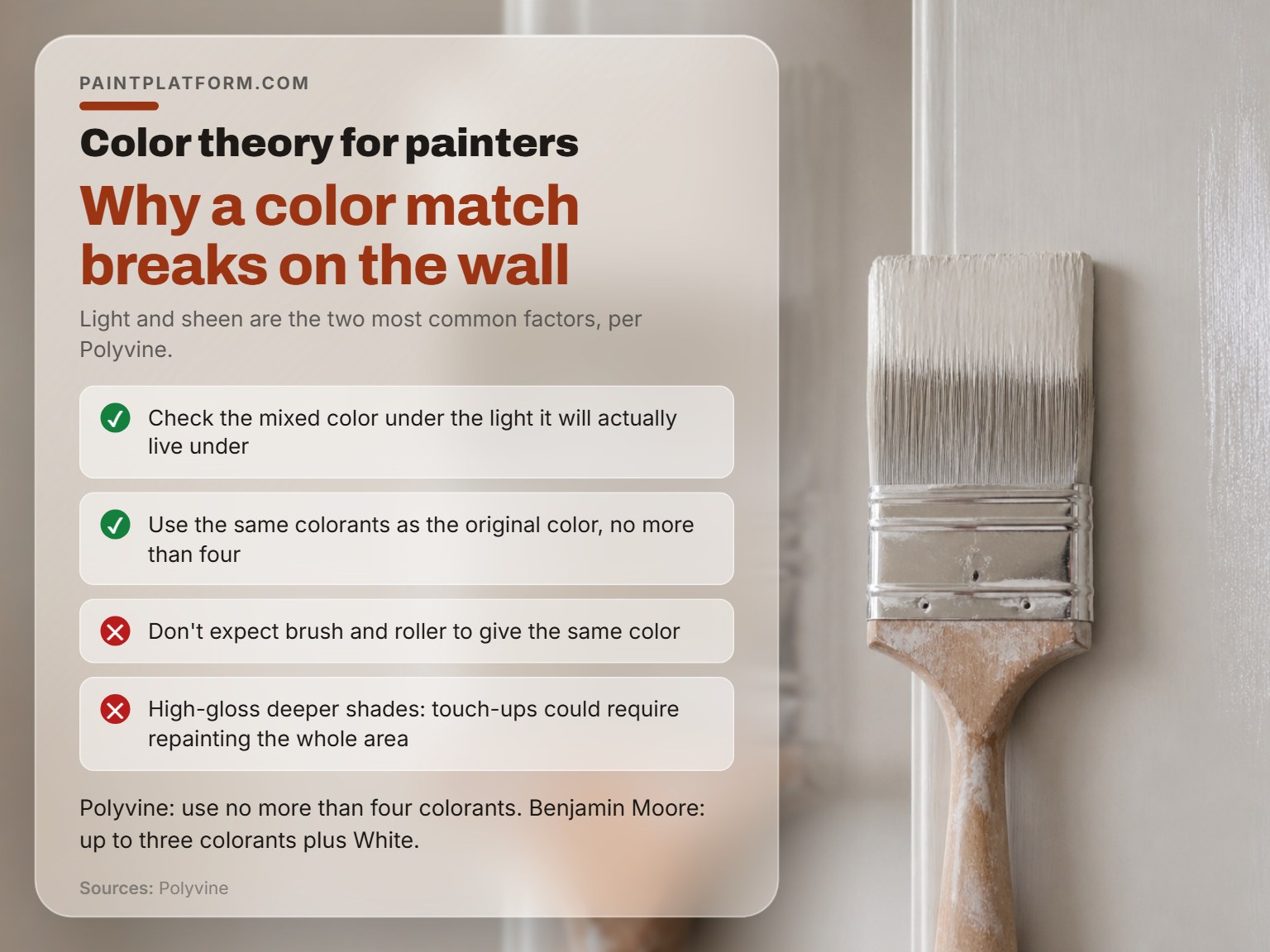
Two colors can match under one light and clash under another. That’s metamerism, and it’s the most common reason a mixed color looks wrong once it’s on the wall or the canvas.
Polyvine’s coatings guidance lists the factors that shift perceived color on a final substrate. Most of it comes down to two things: light and sheen.
- Different substrate
- Film thickness
- Gloss level
- Angle of viewing
- Smoothness of film
- Application and drying method
- Application and paint conditions
- Lighting type
The same principle applies when you’re painting shadows and highlights. A shadow mixed under one light can read as a different color under another.
Check your mixed color under the light it will actually live under. A north-facing studio and a south-facing one are not the same room, and a color that sings in the morning can look dead by afternoon.
Metamerism in Plain English
Metamerism happens when two colors have different spectral curves but look the same under one light. Under a different light, the curves diverge and the match breaks. Polyvine’s fix is to use the same colorants as the original color and cap the count at four, while Benjamin Moore instead recommends up to three colorants plus White and avoiding specific pairings.
Sheen, Substrate, and the Brush-vs-Roller Problem
Polyvine notes that paint applied by brush can appear a different color than paint applied by roller. High-gloss deeper shades are the most sensitive, and touch-ups in those shades can require repainting the whole area instead of just the spot.
Don’t judge a mix on the palette. Wet paint reads darker and glossier than the dry film, so a color that looks right on the palette can dry a full step lighter. Wait for the swatch to dry before you commit.
Which Colorants to Reach For (and Which Combinations to Avoid)
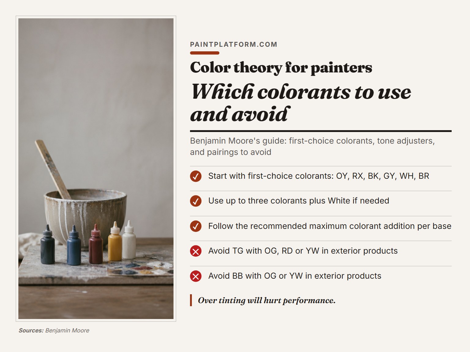
Benjamin Moore’s color-matching guide names six first-choice colorants: Oxide Yellow, Oxide Red, Black, Gray, White, and Brown. Most colors can be hit with three colorants plus white.
| Colorant Type | Examples | When to Use |
|---|---|---|
| First choice | Oxide Yellow, Oxide Red, Black, Gray, White, Brown | Start here for most colors |
| Tone adjusters | Bright Blue, Thalo Green, Magenta | Adjusting hue or tone |
| When needed | Yellow, Red, Orange | Achieving specific colors |
The guide also lists tone adjusters and a third tier for when the basic color needs them. Over-tinting hurts performance, so follow the recommended maximum addition per base.
Benjamin Moore’s guide warns against specific pairings in exterior products: Thalo Green with Orange, Red, or Yellow, and Bright Blue with Orange or Yellow. Those combinations produce gray, and the guide recommends Black or Gray instead.
- Thalo Green with Orange, Red, or Yellow (produces gray)
- Bright Blue with Orange or Yellow (produces gray)
- Any combination past the recommended maximum colorant addition per base
When you’re mixing black paint from complementary colors, the colorant choice matters more than the ratio. A black built from Thalo Green and Oxide Red behaves differently from one built from Ultramarine and Burnt Sienna. The complementary colors that mute a mix are the same ones that turn it to mud if you overdo them. And the mixing gray paint problem is usually a colorant problem, not a ratio problem.
Worth knowing before you start: Over-tinting past the recommended maximum colorant addition per base hurts hide, durability, and reproducibility. The color may look right on the mixing card and fail on the wall later.
I’ve watched a friend chase a color for an hour by adding drops of this and that. The mix got muddier with each addition. Benjamin Moore’s minimum-colorant rule would have saved the afternoon.
Where the Standards Disagree: Formulas, Illuminants, and Colorant Counts
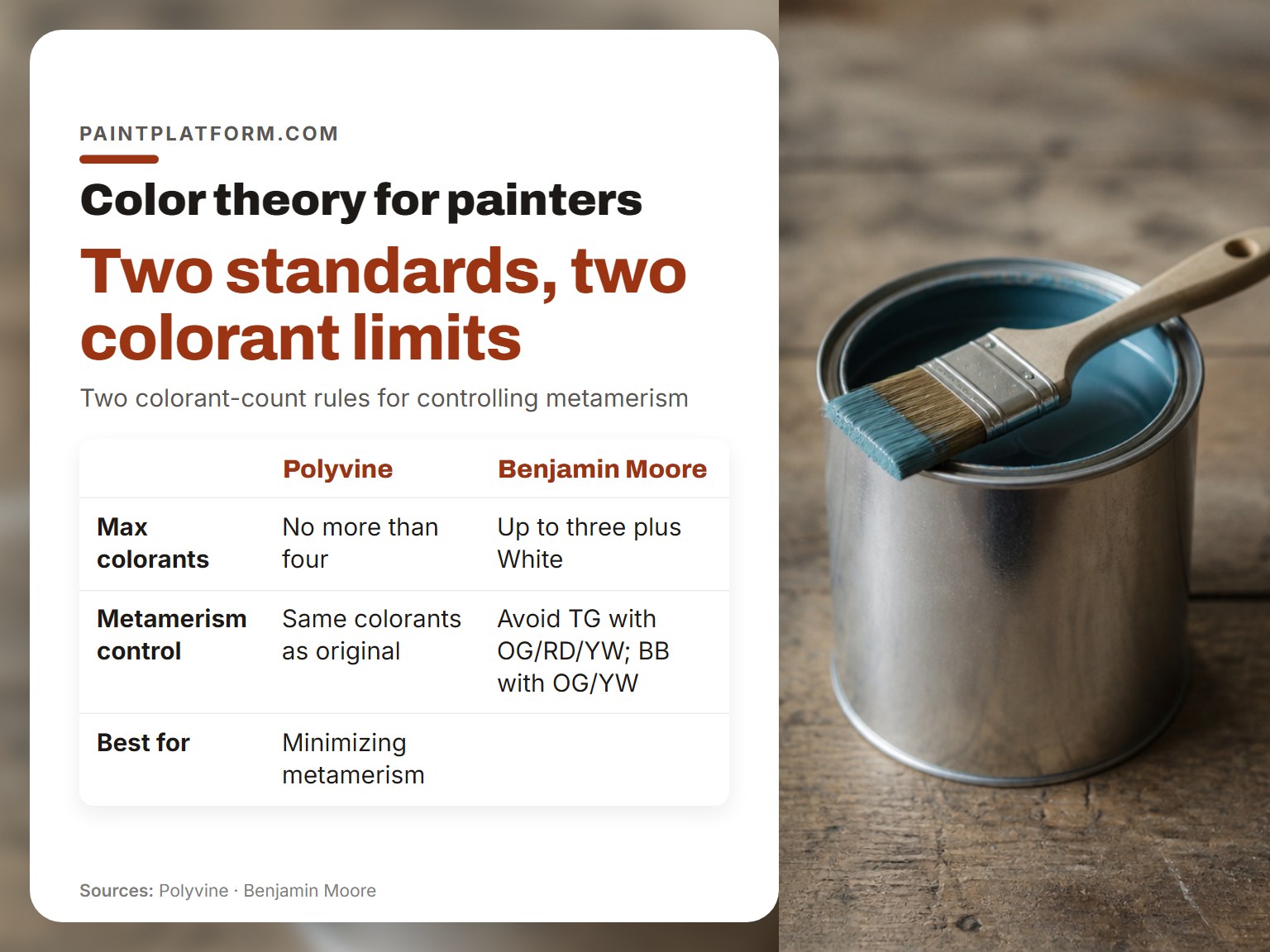
Two standards published decades apart disagree about how complicated a color-difference formula needs to be. Both can be right. “Matching” means different things in different contexts, and the two standards were written for different ones.
| Question | Polyvine Says | Benjamin Moore Says |
|---|---|---|
| Max colorants | No more than four | Up to three plus White |
| Metamerism control | Same colorants as original | Avoid TG with OG/RD/YW; BB with OG/YW |
| Best for | Minimizing metamerism | Cost, hide, durability, reproducibility |
The 1951 JOSA study found that simple color-difference formulas correlated with visual observations as good as or better than complicated ones, while ASTM D2244-23 recommends the more complex Delta E00 for differences in the 0.0 to 5.0 range. ASTM D2244-23, published in 2023, recommends the more complex Delta E00 for differences in the 0.0 to 5.0 range. The 1951 study was grading colour differences; Delta E00 was optimized for small differences across many colors.
The JOSA color tolerance specifications for paint paper is worth reading if you want the historical context.
On the measurement side, the ISO 18314-1 analytical colorimetry standard only applies to films that appear uniformly monochromatic under normal vision. Luminescent, transparent, translucent, retroreflecting, and metallic films are excluded, and films must fully hide the substrate.
ASTM D2244-23 says color-difference equations are optimized for daylight and may not correlate under other illuminants, while the 1951 JOSA study found no appreciable difference between north daylight and an artificial north-daylight source. The 1951 JOSA study found no appreciable difference between north daylight and an artificial north-daylight source. Different eras, different assumptions about what “daylight” means.
I trust the visual check over the number every time. If the mix looks wrong on the paper under the light you’ll actually display it in, the number doesn’t matter. The number is a starting point. Your eye makes the call.
On colorant counts, Polyvine says no more than four. Benjamin Moore says up to three plus white. Both are trying to control metamerism, and both are right about their own products. Pick the rule that matches the paint you’re using and test it.
I once photographed a finished painting under a desk lamp at night and the colors came out warm and wrong. I reshot it near a window in daylight. The lesson stuck: the light you judge under is the light you’re actually painting.
Frequently Asked Questions
How many colors do I actually need to start painting?
Three tubes plus white. Pick a warm and cool version of each primary if you can, but three is enough to learn. Student-grade tubes are fine for learning the basics.
What is Delta E00 and why should I care?
Delta E00 is a number that describes how different two colors look to a human eye. The smaller the number, the closer the match. ASTM D2244-23 recommends it for differences in the 0.0 to 5.0 range.
Why does my mixed color look different on the wall than on the mixing card?
Metamerism. Two colors can match under one light and clash under another. Substrate, sheen, and film thickness also shift the perceived color. Check the mix under the light it will actually live under.
Is the Kubelka-Munk model useful for a hobby painter?
It’s useful as a concept, less useful as a calculator. The model predicts mix colors from base paint spectra, and a peer-reviewed study hit 1.49 Delta E00 average error on a five-paint palette. But it assumes opaque, alla prima paint. For washes and glazes, test on paper.
Should I use a color wheel?
As a reference, yes. As a rulebook, no. The wheel helps you see which direction a primary leans, but mixing real swatches teaches more than any diagram.
What is the difference between Delta E00 and Delta E*ab?
Delta Eab is the older, simpler formula. Delta E00 is the more recent equation, and ASTM D2244-23 recommends it for differences in the 0.0 to 5.0 Delta Eab range. For small differences, Delta E00 correlates better with what the eye actually sees.
The Bottom Line
One rule most guides skip: if you’ve been mixing with many pigments on the palette at once, drop to three plus white. The mud problem usually solves itself. You’ll fight the limited palette for the first hour, and then something clicks.
Start with a warm and cool version of each primary, mix a chart in the sketchbook, and check the result under the light it will actually live under. That’s the whole method. The standards and the research back it up, but you don’t need to memorize them to use it.
This all assumes you’re working in opaque or alla prima paint. If you’re building thin washes or glazes, the Kubelka-Munk predictions get less reliable, and you’re back to testing on paper. That’s fine. Testing on paper is how you learn.
I’d rather see a beginner with three tubes and a messy chart than a beginner with a large pan set and no idea what to do with it. The three tubes will teach you more than a large pan set.
