
How Lighting Changes Paint Colors: What Research Shows
This post contains affiliate links. As an Amazon Associate, we earn from qualifying purchases.
How lighting changes paint colors splits into two separate effects. The light source shifts which wavelengths reach your eye, moving a color along the red-green and yellow-blue axes. The paint’s binder and pigment decide how much total color change happens. Spectrum moves the hue; chemistry sets the pace.
That split matters because it flips the usual advice. You can spend an hour comparing bulbs and still pick the wrong color. The bulb tells you which way the color will drift. The paint’s chemistry sets how far it goes.
What follows: the measured data from a peer-reviewed LED study, the color temperature rules most painters get wrong, and a testing routine you can run this weekend with three sample pots and a windowsill.
Key Takeaways
- Spectrum sets the direction, binder sets the distance. A 2021 LED study found no significant link between light type and total color change, only between light type and axis shift.
- Acrylic and alkyd stayed stable through the full 5000 hours of exposure.
- Warm 2700K bulbs soften whites; 5000K daylight bulbs push them cool. BEHR’s own testing shows the shift clearly on Even Better Beige and Half Sea Fog.
- Test under your real room light, not the store light. 8oz samples moved around the room beat any paint chip.
Why the Same Paint Looks Different Under Different Lights
A paint film’s apparent color depends on three variables: the spectral power distribution of the light source, the reflectance curve of the pigment, and the angle at which light reaches the eye. Change any one and the perceived color shifts, even when the paint itself has not changed.
The 2021 Scientific Reports study on LED museum lighting found something that surprises most painters. The 2021 study found no significant relationship between the lighting system and the overall CIELAB ΔEab color change, though it also found a weak but significant relationship between the illuminant and shift along the a and b* axes.
But the same study found a weak but significant relationship between the illuminant and the shift along the a and b axes. So the direction of the shift does depend on the bulb. Spectrum steers; chemistry sets the size of the drift.
This is why two paints with the same undertones can look completely different in a north-facing room and a south-facing one, a clear example of how lighting changes paint colors. The bulb or window changes which way each color leans, even when both colors sit in the same family.
The peer-reviewed LED paint color study measured this at 2400 hours and 5000 hours of exposure. The biggest change happened by 2400 hours. After that, the shift slowed and reached its maximum at 5000.
What the Research Actually Shows About LED vs Halogen
Three lighting systems went head to head in the 2021 study, tested against self-made acrylic, alkyd, and linseed oil paint samples. Two were LEDs with different blue peaks. One was a traditional halogen lamp.
| Light source | Blue peak | Documented color effect |
|---|---|---|
| Halogen | Traditional incandescent | Greatest shift along the red-green a* axis |
| LED A | 420 nm | Largest change along the yellow-blue b* axis |
| LED B | 460 nm | Tested alongside; total color change similar to the others |
The linseed oil binder combined with ultramarine blue PB29 had the highest total color change of any sample. Acrylic and alkyd mock-ups stayed stable across the full 5000 hours.
That result breaks a common assumption. You can pick a lightfast pigment and still watch it shift, if the binder underneath it is the wrong one for the job.
The light aging of fluorescent paints tells a similar story from a different angle. Daylight fluorescent pigments showed light sensitivity in the BW3 to BW4 class, which is very sensitive in museum terms. A just-noticeable difference of ΔE00 = 1.5 showed up between 2 and 6 million lux-hours. In a museum setting, that’s 3 to 10 years of permanent exhibition.
How Does Color Temperature Change What You See?
Color temperature is the number on the bulb box, measured in Kelvin. It runs from warm bulbs at 2700K up to cooler daylight bulbs at 5000K. The number changes what your eye reads as white.
BEHR tested this directly on two of their own colors. Even Better Beige and Half Sea Fog were photographed under three bulbs: 2700K, 3500K, and 5000K.
| Color temperature | Effect on whites and neutrals | Example from BEHR testing |
|---|---|---|
| 2700K warm | Enhances creamy, yellow, peach undertones; softer whites | Whites feel warmer and more inviting |
| 3500K true white | Balanced; neither too cool nor too warm | Even Better Beige looks balanced; Half Sea Fog appears muted |
| 5000K daylight | Emphasizes blue and gray undertones; crisper look | Even Better Beige loses warmth; Half Sea Fog reads noticeably bluer |
Warm bulbs (2700K) and what they do to whites
If you want a soft, cozy room, that’s your bulb. If you want a crisp gallery look, it will fight you.
Daylight bulbs (5000K) and the blue shift
A 5000K bulb does the opposite. It pushes blue and gray forward, which makes a white look cleaner and a beige look cooler. BEHR notes that if you want to reduce orange or yellow tones in a paint, a daylight bulb is the tool for the job.
If you want to dig into the Kelvin and CRI side of this, the numbers are useful but the eye test still wins.
The NIST blog on lighting and color perception covers the science behind color rendering if you want to go deeper.
Sheen and Gloss: Why the Same Color Reads Lighter
Two cans of the same color, one flat and one semi-gloss, will not look like the same color on the wall, another case of how lighting changes paint colors. This trips up more people than any other lighting issue.
Dunn-Edwards explains why in their technical bulletin. Higher sheen reflects light more directly and uniformly, creating what they call specular reflection. Lower sheen scatters light in multiple directions because the flat surface is rough and irregular under magnification.
The practical result: the same color in two sheens can appear lighter or darker side by side. The higher sheen paint also enhances shadows and highlights, which adds contrast and depth.
Higher numbers mean higher gloss.
Specular vs diffuse reflection
Run your hand across a flat wall and a gloss wall in the same room. The flat one feels chalky. The gloss one feels slick. That difference in surface texture is what scatters or bounces the light.
Here’s a detail that surprises people. If you tilt the same color sample to a steeper angle, the colors across sheen levels start to look more similar. That’s because the light and gloss reflect to your eye at a similar, predictable angle.
I once painted two adjoining walls the same color in different sheens without realizing it. I was convinced the paint had been mixed wrong before I figured it out.
Common mistake: Judging a color from a small chip under store lighting. The chip is flat, the wall may be eggshell, and the store bulb is nothing like your living room. The mismatch shows up the moment the paint dries.
If you want to test paint colors properly, paint the sample on a board in the same sheen you’ll use on the wall.
Time of Day and Room Direction
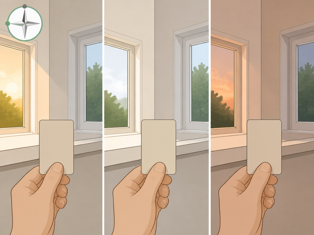
In the morning the wall looks warm, almost peachy. At midday it’s washed out and flat. Toward sunset it’s back to a soft amber. Nothing about the paint changed.
Polyvine’s guide lays out the pattern clearly. Morning sunlight is warmer because the sun is lower on the horizon, which gives a yellowish cast. At midday, sunlight turns cool and bluish, and color can look washed out in direct sun. Toward sunset, daylight warms again with a reddish cast.
Season matters too. Winter sunlight is a bit cooler and bluer than summer sunlight.
BEHR adds room orientation to the list. Natural light shifts depending on the time of day and which way the room faces. That’s why west-facing rooms get that warm evening glow, while north-facing rooms stay cool and indirect all day.
I keep a sample board on my own windowsill and move it around through the day. The same beige reads warm in the morning and gray in the afternoon.
If your room doesn’t get much sun at all, low-light rooms have their own rules. Colors that look rich in a sunny room can go flat in a dim one.
The Binder Problem: Why Lightfast Pigment Advice Fails
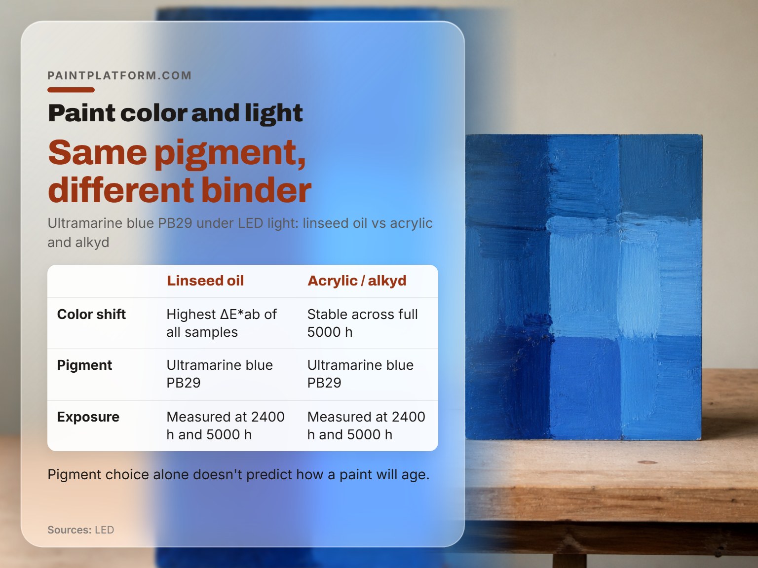
Linseed oil combined with ultramarine blue PB29 had the highest color shift of any sample in the 2021 LED study. That’s a permanent, lightfast inorganic pigment. The binder underneath it was the problem.
Acrylic and alkyd mock-ups of the same pigment stayed stable across the full 5000 hours. Same pigment, different binder, completely different outcome.
This is the part most paint guides skip. They tell you to pick a lightfast pigment and stop there. The 2021 study shows that pigment choice alone doesn’t predict how a paint will age.
There’s a second effect that runs the other direction. A 1985 study in the Journal of the American Institute for Conservation found that daylight actually bleaches out dark-induced yellowing from drying oils. Paint films that yellowed in storage went back to near their original whiteness after exposure to diffuse indoor daylight.
The same study found the bleaching depended on net exposure, meaning intensity times time, over a 30-day period. After four dark cycles, 3.5-year-old paint films could still be bleached to their initial whiteness.
Among the formulations tested, a soya alkyd mixture yellowed the least throughout and bleached to the same original whiteness. That made it the least yellowing of the compared formulations.
The conservation research on lighting effects is worth reading if you work with oils. The short version: some yellowing is reversible, and the binder decides how much.
How to Test Paint Colors Under Real Light
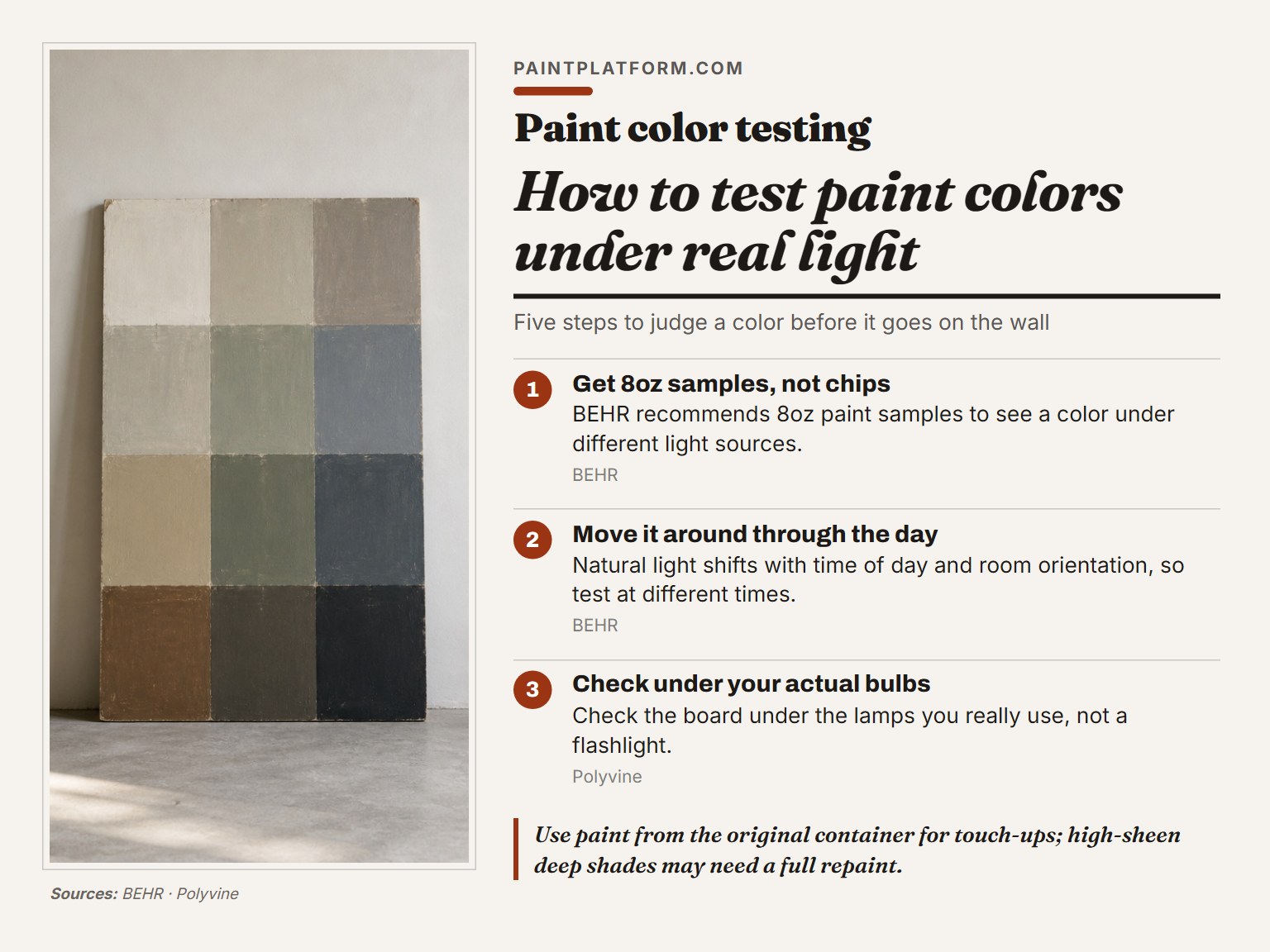
Here’s the routine I use and recommend. Here’s the routine I use and recommend.
- Get 8oz samples, not chips. BEHR recommends 8oz paint samples so you can see how a color appears under different light sources. A chip is hard to judge.
- Paint the sample on a large board. Paint the sample on a large board so you can read the color without the wall color bleeding in.
- Move the board around the room through the day. Light changes through the day, so test at different times. Don’t skip any of them.
- Check it under your actual bulbs at night. If you have warm lamps in the living room, check the board under those lamps, not under a flashlight.
- Use paint from the original container for touch-ups. Polyvine is blunt about this. A different batch can read slightly off, and high-sheen deep shades may need a full repaint of the area rather than a spot touch-up.
Why the original container matters
Polyvine notes that high sheen and deeper shades are where mismatches show most.
Where this goes sideways: Judging wet paint on the palette. Wet paint dries lighter, so the color you approve at the mixing stage is not the color that ends up on the wall.
I learned that one the slow way. I once had a student who kept insisting her mixed green looked wrong on the canvas. We’d check the palette, remix, and it would still look off. The problem was she was judging the wet paint. Once she started mixing a little darker than her target and letting the swatch dry, the color matched.
For the bigger picture on how to choose paint colors for a room, the sample board is the foundation. Everything else builds on it.
Where the Experts Disagree About Ideal Light
Two credible sources disagree about the best light for judging color, and both are right for different jobs.
Dunn-Edwards calls direct sunlight the most ideal light source because it gives the truest interpretation of color and the best balance between warm and cool extremes, while Polyvine holds that colour should be checked under the normal lighting conditions that will prevail for the substrate.
Polyvine takes a different position. Sunlight is the purest light, but it changes over time, and color should be checked under the normal lighting conditions that will prevail for the coated substrate.
The two positions serve different purposes. If you’re evaluating a color in isolation, sunlight is the cleanest reference. If you’re choosing a color for a specific room, the room’s own light is the only test that matters.
There’s a similar split on standard procedures. The visual assessment standard covers lighting and procedure for visual assessment of coating defects. Using it for a color match would be the wrong tool.
If you want to go deeper on warm vs cool theory, that’s the next layer. The practical answer is simpler: test under the light you’ll actually live with.
Frequently Asked Questions
Does paint look darker or lighter under different bulbs?
Both, depending on the bulb. A 2700K warm bulb makes whites look softer and enhances creamy, yellow, or peach undertones. The paint stays the same. The wavelengths reaching your eye shift.
Why does my paint look different at night than during the day?
Natural light shifts through the day. Morning sun is warm and yellowish. Midday sun is cool and bluish. Evening sun warms again with a reddish cast. At night, your artificial bulbs take over and add their own color temperature on top of that.
Can I trust the paint chip from the store?
No, and this is the most common mistake. A chip is small, flat, and lit by store bulbs that have nothing to do with your room. BEHR recommends 8oz samples so you can see the color under different light sources before committing.
How long does it take for paint to change color under light?
It depends on the binder and pigment. In the 2021 LED study, the biggest color change happened by 2400 hours of exposure, with the shift slowing after that and reaching its maximum at 5000 hours. Some pigments shift much faster. Daylight fluorescent paints can show a just-noticeable difference in as little as 2 to 6 million lux-hours.
Do LED bulbs fade paint faster than halogen?
The 2021 study found no significant relationship between the lighting system and the total amount of color change. LED A, LED B, and halogen all produced similar overall ΔE*ab. What differed was the direction of the shift along the color axes. Halogen pushed the red-green axis hardest; LED A pushed the yellow-blue axis hardest.
The Bottom Line
One rule I’d tape to the paint can: if you can’t see the sample under the light you’ll live with, you haven’t tested it yet. The bulb, the sheen, and the time of day all change what your eye reads. The paint itself is the only variable that stays still.
If you’re choosing between two colors that look identical in the store, pick the one that holds up in the morning and evening in your actual room. That’s the color you’ll live with.
And if you’re working with oils or a binder you don’t fully trust, test a small panel first. Linseed oil plus ultramarine blue PB29 was the worst combination in the 2021 study, and it’s a permanent pigment. The binder is what betrayed it.
