
How to Use a Color Wheel for Interior Painting: 3 Steps
This post contains affiliate links. As an Amazon Associate, we earn from qualifying purchases.
To use a color wheel for interior painting, pick a harmony first (adjacent colors for calm, opposites for contrast), then let one dominant color cover about 60 percent of the room and a secondary take 30, with an accent on the last 10. Test the pick on a large sample before you buy a full can.
That 60 percent number comes from the 60-30-10 rule, which This Old House spells out as dominant color for 60 percent of the room, secondary color for 30, and accent for 10. It sounds fussy until you notice what it’s actually doing: it stops a room from turning into a fight between four equally loud colors.
What follows walks the wheel in the order you’ll actually use it: reading the harmonies, picking a dominant, balancing warm and cool, and testing the color in the room before the paint goes on the wall.
Key Takeaways
- Pick a harmony first, a color second. Adjacent colors read calm, opposites read dramatic, and one hue with value shifts reads quiet and simple.
- Let one color lead. The 60-30-10 rule (60 percent dominant, 30 secondary, 10 accent) keeps a room from feeling like four colors shouting at once.
- Test on a large surface, not a chip. Donald Kaufman recommends a swatch at least 5 to 6 feet wide, floor to ceiling, two coats, lived with for a few days.
- Warm and cool amounts should be unequal. NMSU’s color guide says unequal amounts of warm and cool are most pleasing, which is why one accent usually beats a 50/50 split.
- Skip the color-of-the-year pressure.
How to Use a Color Wheel for Interior Painting
The wheel is a map of relationships. It tells you which colors sit near each other, which sit opposite, and where a third color would land if you wanted a triangle instead of a line.
A standard color wheel places red, blue, and yellow at even points around the circle. Mixing two primaries in equal parts produces the secondaries: orange, green, and violet. Tertiary colors sit between a primary and its neighboring secondary, and the twelve positions together give a complete map of hue relationships before value or intensity enters the picture.
That’s the whole tool. It doesn’t know your room, your light, or your furniture. It just shows you where each color sits relative to the others, and you do the rest.
It’s a vocabulary, not a verdict.
One thing worth flagging: the wheel most paint brands and design guides use is the traditional red-yellow-blue artist’s wheel. Dulux and This Old House both describe primaries as red, blue, and yellow. That’s the wheel you’ll see on a fan deck, even though paint tinting at the counter works from a different mixing model.
The how to use a color wheel for interior painting question is the same skill as using one on a canvas, with bigger stakes and worse lighting.
If you want the fuller version of how these relationships work, the color theory basics walk through hue, value, and intensity one at a time.
Value and intensity are the two dials the wheel doesn’t show you. A tint is a pure hue plus white. A shade is a pure hue plus black. A tone is a hue with neutral gray added. That’s from Architectural Digest’s breakdown, and it matters because most of what you’ll actually put on a wall is a tint or a tone.
NMSU’s NMSU guide to color adds a blunt point: hues can only degrade in intensity. Adding any other color to a pure hue makes it less intense, never more. So the dusty sage you loved on the chip is already a muted version of green, and it will read even softer once it covers a wall.
Three things the wheel does not tell you:
- How the color will look in your north-facing living room through the day
- How it will read next to your existing sofa
- How intense it will look at wall scale compared to a small chip
That last one is the one that gets people.
Which color harmony fits the room you’re painting?
Start with the mood you want, not the hue. That’s the advice Barbara Richardson, director of color marketing at Glidden, gives in This Old House: ask how you want the space to feel first, then choose a soothing single color or a brighter combination.
Here are the harmonies side by side:
| Harmony | What it does | Best for |
|---|---|---|
| Adjacent (analogous) | Neighbors on the wheel, one color running through | Calm, restful rooms |
| Opposite (complementary) | Direct opposites, high contrast | Feature walls, bold accents |
| One hue (monochromatic) | Same color, different values and intensities | Small rooms, quiet spaces |
| Three evenly spaced (triadic) | Balanced but lively, three colors at even points | Playful or eclectic rooms |
| Split complementary | A primary plus the two colors beside its opposite | Contrast with less risk |
Dulux UK frames the same three core options in simpler language: harmonious colors sit next to each other, tonal schemes use tones of one color, and contrasting colors lie opposite each other. The harmony names change between brands, but the geometry on the wheel doesn’t.
Dulux also has a practical rule for their in-store Colour Wall: jump 3 pillars left or right to find a contrasting palette.
Complementary: the high-contrast option
Opposite colors share no common hue, which is why they read as a jolt. Architectural Digest describes complementary pairs as creating strong contrast that can energize a room. This Old House gives the classic pairs: blue and orange, red and green.
Here’s where the sources split. NMSU’s guide calls opposite-color combinations more difficult to use than neighboring colors and says reddish hues are the hardest to handle. Benjamin Moore frames the same pairing positively, as a dash of invigorating tension.
Both are describing the same geometry. The difference is how much risk you’re willing to take.
NMSU’s practical fix is worth keeping: one of the two complements should be dull, light, dark, or used in a small amount. That’s the difference between a room that feels intentional and one that feels like a sports team.
If you want to go deeper on complementary color pairs, the mechanics are the same on canvas and on a wall.
Analogous: the calm option
Neighbors on the wheel. This Old House gives blue, blue-green, and green as the example. NMSU describes the effect as quiet and restful, with one color running through the entire group.
Decorative painter Mark Chamberlain has a trick for keeping a neighboring scheme from going flat: warm one hue up and cool the other down. The two colors stay related, but they don’t blur into each other. The two colors stay related, but they don’t blur into each other.
Monochromatic: the simplest option
One hue, different values and intensities. NMSU calls it the simplest scheme and warns about the obvious risk in the same breath: it can go tiresome and boring. Texture is the fix. A matte wall with a satin trim and a nubby throw does more for a one-color room than another shade of the same paint.
Benjamin Moore suggests an ombre version, painting walls with different shades of one color and keeping the darker hue closer to the bottom.
If a one-color room feels too quiet, an accent wall color gives you a place to add contrast without repainting everything.
Triadic and split complementary: for the brave
Triadic uses three colors evenly spaced around the wheel. This Old House names red, yellow, and blue as the classic example. Split complementary combines a primary with the two colors on either side of its opposite. NMSU notes one constraint: you can’t start a split complementary scheme with a secondary color, because its complement is a primary and a primary can’t be split.
These are the harmonies that look great on a mood board and terrifying on a wall. If you want to try one, let one hue dominate and keep the other two as accents.
The 60-30-10 split: how much of each color
Sixty, thirty, ten. That’s the split This Old House recommends: dominant color on 60 percent of the room, secondary color on 30 percent, accent on 10 percent.
The rule sets proportions. It works with any harmony you pick. The point is that one color should clearly lead, one should support, and one should show up in small doses.
The MSFID4016 training resource takes a different approach, advising that you inventory permanent features first and eliminate clashing colors before choosing. The 60-30-10 version is more specific, and it’s the one most designers quote.
NMSU’s guide to color adds a related but separate point: unequal amounts of warm and cool colors are most pleasing. The two rules don’t line up perfectly. The 60-30-10 split sets proportions but doesn’t say anything about warm versus cool. NMSU’s rule is about temperature but doesn’t set specific percentages. Both point the same direction, though: don’t split a room 50/50.
Color consultant Bonnie Krims makes a related point in This Old House: contrast, not color, is what makes a room feel small. Her fix for a compact room is to use all light colors or all dark colors, so the eye doesn’t stop at a hard line between them.
Before you start:
How to apply 60-30-10:
- Pick the dominant color first. It’s the one you’ll see most, so it should be the one you can live with longest.
- Choose a secondary that supports without competing. In a complementary scheme, this is where the duller or lighter version goes.
- Save the accent for the smallest surface. Trim, a single chair, a throw, or one wall if you’re feeling brave.
Adding color to a palette works like seasoning a soup. You add a little, taste, and add more. Dumping in the whole jar of pigment is how you end up with mud.
If you want a longer walk through warm and cool colors, the short version is that warm colors tend to energize and expand a space while cool colors calm and pull it inward.
Warm vs cool: the balance that decides how the room feels
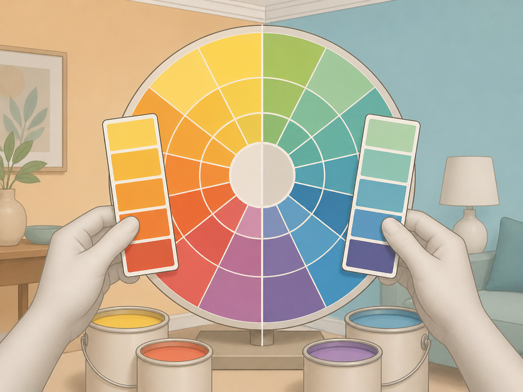
Which side of the wheel is your room already leaning toward? This Old House describes warm colors on the yellow-red side as energizing and expanding, and cool colors on the blue-green side as calming and intimate. NMSU defines them by content: warm if there’s enough yellow or yellow-red, cool if there’s a noticeable amount of blue.
That’s a definition. The mood is separate. A color can be warm and still feel heavy. A cool color can still feel bright. What matters is the balance across the room.
This Old House breaks down the moods by hue:
- Blue promotes calm and relaxation, which is why it shows up in bedrooms and bathrooms
- Green reads as nature and growth, a natural fit for living rooms and home offices
- Red stimulates appetite and conversation, so it works in dining rooms and social spaces
- Yellow brings energy and happiness, suited to kitchens and dining areas
- Purple reads as luxury and creativity, best as an accent or in an artistic space
Where this goes sideways: Painting every wall in a warm color and expecting the room to feel cozy. Warm colors expand, so a small warm room can feel like it’s pressing outward. By week two, you’ll be shopping for a cool neutral to calm it down.
Most paint colors carry paint undertones that push them warmer or cooler than the chip suggests, which is why the same green can read mint in one room and olive in another.
How do you test a paint color before committing?
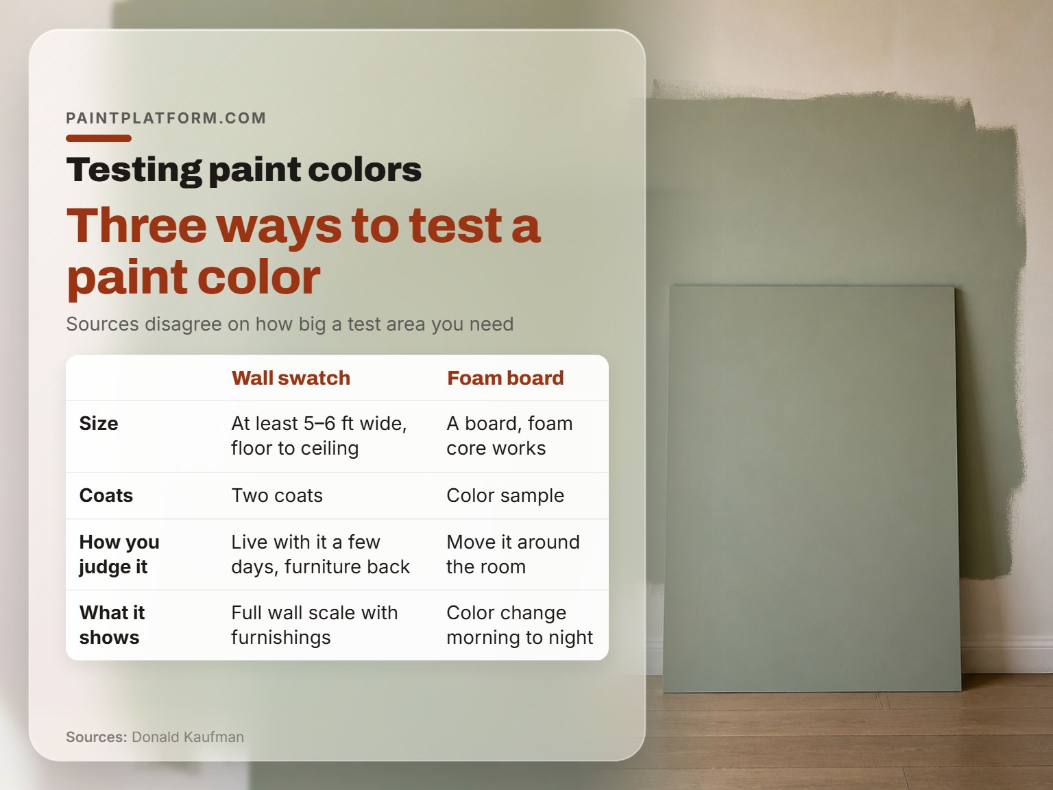
Donald Kaufman, Benjamin Moore, and This Old House all have a method for testing paint, and they don’t agree. The disagreement is worth showing rather than smoothing over.
The wall swatch method
Donald Kaufman, a color expert quoted by This Old House, recommends painting a swatch at least 5 or 6 feet wide, from floor to ceiling, with two coats. Then rehang the art, put the furniture back, and live with it for a few days.
The foam board method
Benjamin Moore recommends a different approach: paint a board (foam core works) with a color sample and move it around different parts of the room, checking how the color changes from morning to night.
The small patch method
This Old House also suggests testing on a small area of the wall before committing to the whole room, which is the fastest version and the least informative.
All three are trying to solve the same problem: a color looks different at wall scale than it does on a chip. This Old House says colors often appear more intense on walls than on swatches. The disagreement is about how much surface you need to see before you trust your judgment.
| Test method | What it shows | Trade-off |
|---|---|---|
| Wall swatch, 5-6 ft, two coats | Full wall scale, with furniture in place | Slow, and you paint over it later |
| Foam board, moved around | How light changes the color through the day | Doesn’t show it next to your trim |
| Small wall patch | Whether the color is close to the chip | Too small to judge at room scale |
It’s a way to see the color in more than one room before you commit to one, and it’s cheaper than repainting a wall.
If you want a longer walk through how to test paint colors on a wall, the short version is simple. Bigger is better, and daylight is the only honest judge.
The chip was tiny. The hallway was not.
One more thing worth knowing: NMSU’s guide says a value scale is sufficient when it shows 7 to 9 values. That’s the range NMSU’s guide gives for a sufficient value scale. If a fan deck shows you many nearly identical greens, you don’t need to see them all. You need to see the two that are far enough apart to read as different colors on a wall.
Furnishings first or fixed finishes first?
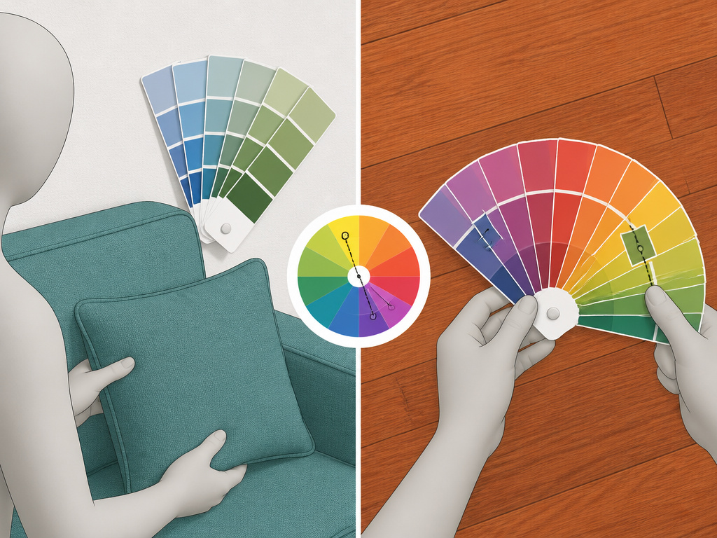
You’ve got a sofa you love, a floor you can’t change, and a blank wall. Which one sets the palette?
The sources disagree on the order of operations, and both positions have a real reason behind them.
If you’re starting from scratch
Bonnie Krims, a color consultant quoted by This Old House, advises selecting furnishings before picking paint colors. Her reasoning: if you do it the other way, you’ll have to match your furnishings to your walls, which is harder than it sounds.
If you’re working around fixed features
The interior and exterior colour schemes training unit from an Australian painting RTO takes the opposite order. It says to inventory the permanent features first, eliminate clashing colors, then choose. The reasoning here is that floors, fireplaces, and cabinetry aren’t going anywhere, so they set the constraints.
Both are right for their situation. If you’re furnishing an empty room, pick the sofa first. If you’re repainting a room with a fixed reddish floor, start from the floor.
Designer Annie Elliott has a specific fix for that second case: if hardwood floors are too reddish orange, paint the walls blue or green, the complements, to tone them down. That’s using the wheel to neutralize a fixed color rather than to create contrast.
The part nobody mentions: The order matters less than the constraint. Whatever you can’t change, work around first. Whatever you can change, pick last.
If you’re working through the full sequence, how to choose interior paint walks the order from fixed features to final accent.
Where the color wheel breaks down
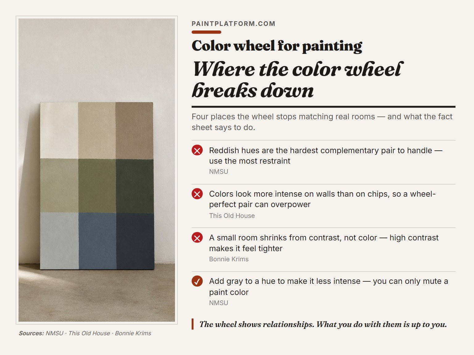
Following the wheel literally can make a room worse. There are a few places where the map stops matching the territory.
- Reddish hues are the hardest complementary pair to handle, per NMSU, and they need the most restraint
- The duller a color, the less power it has to make its complement look brighter, which breaks the assumption that opposites always intensify
- Colors appear more intense on walls than on chips, so a wheel-perfect pair can still overpower a room at scale
- A small room shrinks from contrast, not color, per Bonnie Krims, so a high-contrast harmony can make a compact room feel tighter
The fix in each case is the same: pull back the intensity. Add gray to a hue and it gets less intense, never more, which is the one rule NMSU states flatly. You can only mute a paint color. You can’t make it more intense by adding another color.
The wheel shows relationships. What you do with them is up to you, and that’s true whether you’re using a color wheel for interior painting or mixing on a palette.
If you want the fuller color wheel guide for canvas work, the same logic applies, but the stakes are lower because you can paint over it.
Frequently Asked Questions
Do I need to buy a color wheel to pick paint colors?
No. A fan deck from the paint store gives you the same relationships in a more useful format, because the chips are actual paint. The wheel is a teaching tool, not a shopping tool.
What’s the difference between a tint, a shade, and a tone?
Tint is a pure hue with white added. A shade is a pure hue with black added. A true tone is a hue with neutral gray added. Most wall colors are tints or tones, not pure hues.
How many colors should I use in one room?
The 60-30-10 rule is built around three colors: a dominant, a secondary, and an accent. A dominant, a secondary, and an accent.
What if I hate the color after I paint it?
Test first, so you don’t have to find out. If you’ve already painted, live with it for a while before repainting. Paint colors shift with the light, and a color that feels wrong in the morning can feel right by evening.
Does the color wheel work for exterior paint too?
The relationships are the same, but exterior light is harsher and more variable. Test exterior colors on a board you can move around the house, and check them at the time of day you’ll actually see the house most.
The Bottom Line
To use a color wheel for interior painting, the test is simple: can you name the dominant color, the supporting color, and the accent in one breath?
Stop treating the wheel as a decision-maker. It’s a vocabulary. It tells you what a color relationship is called so you can ask for it, look it up, or avoid it. The decision is still yours, made in your own light, with your own furniture, at wall scale.
This all gets harder if you’re repainting around a fixed floor or a fireplace you can’t change. In that case, start from the fixed thing, find its complement, and build the palette from there. The wheel doesn’t care which color you start with.
One small exercise: pick a few paint chips you like, tape them to a piece of foam core, and move the board around one room at different times of day. From early dawn to nightfall.
