
How to Create a Whole House Paint Color Scheme: Four Jobs
This post contains affiliate links. As an Amazon Associate, we earn from qualifying purchases.
How to create a whole house paint color scheme: assign four jobs. One dominant color, a couple of secondary hues, one trim color, one accent. Benjamin Moore’s own guidance splits on the total, with six or seven hues on its palette page and three to five in its Color Handbook.
Those four jobs do different work, and the order you fill them in matters more than the final count. Get the dominant color wrong and every secondary choice has nothing to answer to.
What follows is the order, the competing starting points designers actually use, and the places where the standard method falls apart.
Key Takeaways
- Six or seven hues is Benjamin Moore’s whole-house target on its palette page, while its own Color Handbook says three to five. Both are manufacturer guidance, and the gap is real.
- Start with the central room, as Benjamin Moore advises, or with the boldest room, as Houzz suggests. The palette grows outward from there.
- Sample in the actual room, on a swatch at least 4 by 4 feet, and watch it for a day or two before you buy a can.
- Primer tinted toward the topcoat helps prevent the previous wall color from interfering with the new one.
- One white on trim and doors ties rooms together, as Sherwin-Williams recommends and Architectural Digest’s designers agree, though Benjamin Moore treats trim as a supporting role with warm and cool options chosen per aesthetic.
Start With One Room, Then Read the Light
Benjamin Moore’s process starts with the central room, usually the kitchen or a space with a fixed focal element, and builds outward. Houzz’s Laura Gaskill names the living room or kitchen as the likely candidate.
A room’s compass direction and its mix of natural and artificial light decide whether a warm or cool undertone belongs on the walls. Benjamin Moore recommends settling that question before selecting any specific hue. Light volume matters as much as direction: a bright room and a dim one wear the same color differently.
Before you think about hue, answer four questions from the Benjamin Moore Color Handbook. They point at warm or cool long before they point at a color name.
- Main function. A study and a nursery pull in different directions.
- Who uses it, and when. A room that’s busy at 7am and empty by 9pm reads differently from one used after dark.
- Fixed elements. Flooring, countertops, and tile carry their own color and aren’t going anywhere.
- What you’re keeping. Furniture and art narrow the field faster than any paint chip.
Light quality changes what you see, not what’s in the can. Carl Minchew of Benjamin Moore told This Old House that the pigment stays the same and only your perception shifts, whether the bulb is yellowish incandescent or bluer fluorescent.
That’s why Sherwin-Williams tells people to avoid picking a color at the store. A swatch on the wall in morning light and the same swatch at night are two different colors, and the store’s lighting is a third. The same wall can look grey at noon and cream at night, which is why lighting and paint decisions belong in the room, not the aisle.
Where to start is genuinely contested. Benjamin Moore says the central room. Houzz offers a second route: begin with the room you want to paint the boldest color, then choose softer, more subdued colors as you move outward. Gaskill flags the risk herself, noting that bold colors placed next to each other carry more risk.
| Starting point | Who recommends it | Best for | The risk |
|---|---|---|---|
| Central room | Benjamin Moore, Houzz | Homes with one obvious hub | Slower to reach the rooms you enjoy |
| Boldest room | Houzz | People who already love one strong color | Bold beside bold carries more risk |
| Favorite object | Sherwin-Williams | Furnished homes with a favorite rug | Its undertone spreads through the house |
| Furnishings first | This Old House | Rooms being furnished from scratch | Paint waits until the furniture lands |
If you’re still circling the first room, paint colors for a room is a narrower question than the whole house, and it’s easier to answer first. I’d rather answer those four questions than stare at a fan deck for an hour.
How Many Hues Does a Whole House Palette Actually Need?
Benjamin Moore’s palette page says six or seven. Its own Color Handbook says three to five. Same manufacturer, same general purpose, two different numbers.
Neither page explains the gap. The palette page counts every role in a full house: dominant, a few secondary colors, trim, accent. The Handbook frames three to five as a guideline for a harmonious scheme. Read them as a range rather than a rule.
Honestly? Start smaller, and stop adding when a new hue doesn’t earn its place.
The featured palette on Benjamin Moore’s page is built around Quiet Moments 1563, a soft grey-green. That’s a “between” color, sitting between two families, and the page argues those colors add layers and complexity to secondary rooms.
Houzz takes the opposite risk posture. Gaskill’s method is to pick the next color up or down on the same paint chip, or have the same color mixed with white added to make a lighter version. That’s safer and less interesting, and both descriptions are fair. If you want the reasoning behind shared undertones and analogous schemes, color theory explains why adjacent families cooperate and opposites fight.
My read: build toward the lower end of the range, and stop adding when a new hue doesn’t earn its place.
Dominant, Secondary, Trim, Accent: The Four Jobs
Four roles, four different amounts of wall. Benjamin Moore’s featured scheme makes the split concrete: Chantilly Lace OC-65 on walls and ceiling, Teardrop Blue 2053-60 on the back walls, Shadow 2117-30 above the fireplace.
| Role | Share of the room | Named example |
|---|---|---|
| Dominant | 60% | Chantilly Lace OC-65 |
| Secondary | 30% | Teardrop Blue 2053-60 |
| Trim | Supporting role | Swiss Coffee OC-45 or Ice Mist OC-67 |
| Accent | 10% | Shadow 2117-30 |
What the 60-30-10 Rule Actually Measures
The 60-30-10 rule shows up in both Benjamin Moore’s guidance and This Old House’s, with the same numbers: 60% dominant, 30% secondary, 10% accent. This Old House translates it into surfaces, with walls as the dominant color, upholstery or flooring as the secondary, and accessories or artwork as the accent.
Treat it as a ratio for one room, not a shopping list. A room that’s 60% wall, 30% sofa, and 10% cushion is already following it. I keep the ratio in my head as wall, sofa, cushion, in that order.
Here’s the build order, and what each step costs you if you skip it.
- Pick the dominant color for the central room. Skip this and every later choice has nothing to answer to.
- Choose two or three secondary colors for the foyer, dining room, and any space that visually connects back. A shared undertone, an analogous scheme, or shades of one color all work. Skip the connection and the house reads like separate apartments.
- Set the trim color. Off-white is the most common choice. Warm white Swiss Coffee OC-45 reads comforting; cool white Ice Mist OC-67 reads modern.
- Add one accent, in moderation. Benjamin Moore’s own advice is to hold back unless you’re going maximalist.
- Sample all of it in each room. A palette that looks right on a mood board can fall apart under a warm bulb.
Do Warm and Cool Tones Have to Stay Separate?
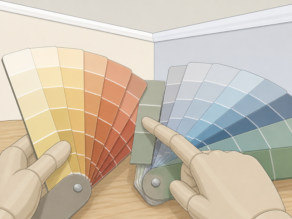
Leah Alexander, a principal designer in Atlanta, says decide on a cool-tone or warm-tone palette and stick to it. Mixing the two, she told Architectural Digest, is jarring.
Benjamin Moore’s guidance runs the other way in practice. The palette page suggests choosing warm or cool per room based on the direction it faces and how much light it gets, and it promotes “between” colors like green-grey and pink-beige that blend families.
Both can be true if you scope them differently. A single sightline wants one temperature. A whole house with a closed-off upper floor can carry two moods, and Houzz suggests working on upstairs and downstairs spaces separately for exactly that reason.
Pick one temperature for rooms that share a sightline. Warm light pushes whites toward yellow, and Benjamin Moore’s own guidance is to switch shades rather than fight it.
Common mistake: Choosing a cool white for trim and a warm white for the ceiling in the same room. The two whites meet at the wall line, and the seam reads as a color change you didn’t plan.
How to Create a Whole House Paint Color Scheme Without Wasting Sample Pots
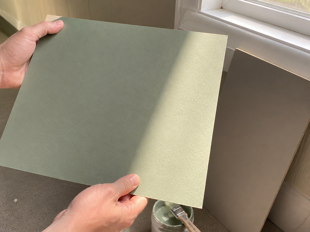
Sherwin-Williams says it plainly: don’t pick a color at the store. Test a swatch on the wall and look at it in different lighting and at different times of day.
That’s the one point where my main sources line up. Houzz says sample cards, even the big ones, can be deceptive, and pushes for physical test pots. This Old House asks for a swatch of at least 4 by 4 feet, watched for a day or two, or sample pots painted onto poster board you can move around.
I keep a stack of poster board squares painted with every color I’ve ever considered. Moving one from the hallway to the bedroom takes moments, and it has talked me out of more bad colors than any app.
A painted board is easier to read than a chip. The color sits flat and even, and you can see whether it goes chalky in the corner where the light drops off. I’ve moved the same board from a hallway to a bedroom and watched it turn from grey to green. Same board, same paint, different window.
If you want the full method, testing paint colors walks through wall swatches versus movable boards, and sample pots are the cheapest part of the whole job.
Where the Standard Method Breaks Down
A kitchen with oak cabinets that throw a red cast. A 1920s hallway with chocolate-brown trim. A cottage two blocks from the water. Each one breaks a different rule in the standard advice.
- Red-undertone cabinetry. Sherwin-Williams says check the wall color against that hue before anything else. A neutral that ignores it looks dirty next to the wood.
- Historic trim in dark wood. Leah Alexander’s example: rich chocolate trim and wainscoting may not work with an icy cool wall. The trim is fixed, so the wall has to move.
- A seaside house. Gary McBournie says a moody interior can be hard to pull off in a coastal setting. Match the surroundings or fight them, but decide on purpose.
- An open plan. Houzz says map what’s visible from each room before choosing anything.
- A long, narrow room. Sherwin-Williams suggests a slightly darker color on the shorter walls and a lighter one on the longer walls to widen it.
Where this goes sideways: Choosing a wall color before checking the cabinet undertone. The wood casts red, the neutral reads green beside it, and no amount of lamp swapping fixes a clash you built in on purpose.
When the Room Underneath Fights Back
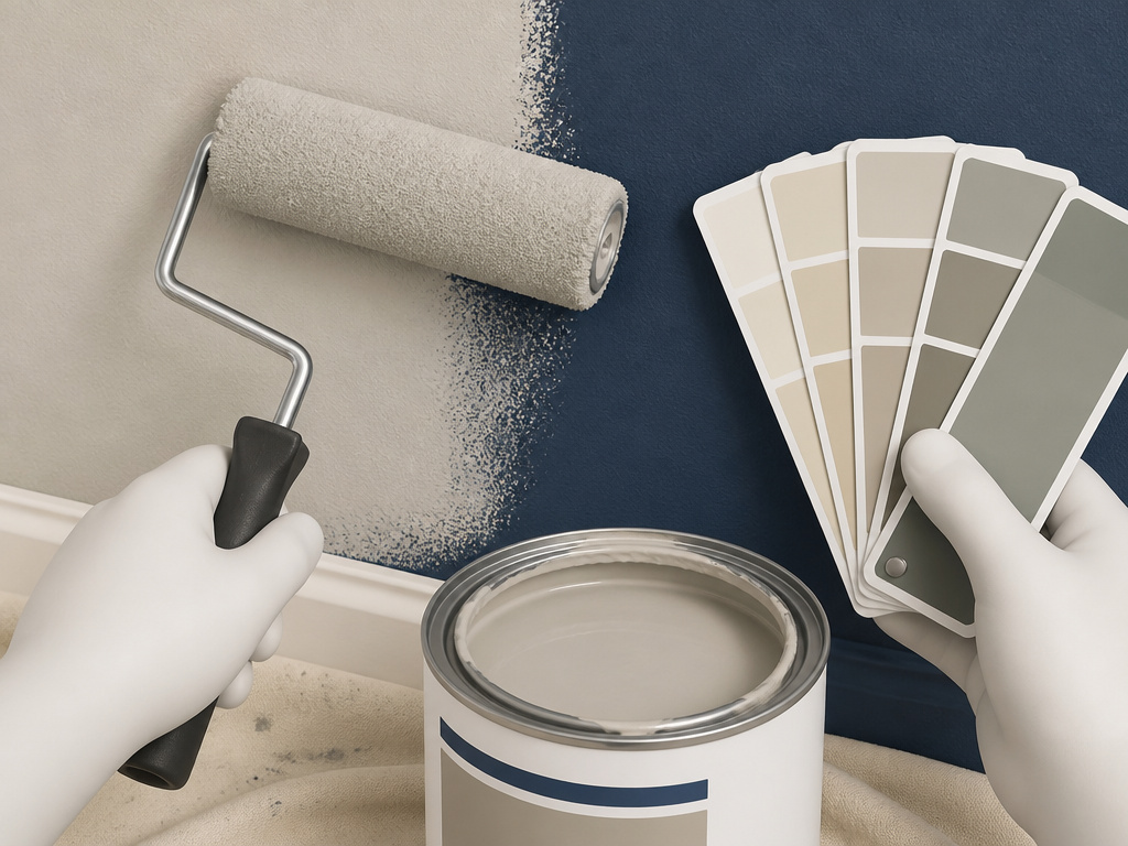
The color already on the wall is the edge case nobody plans for. I repainted a navy dining room to a pale greige once and it took several coats before the blue stopped bleeding through.
The second time I did it, I asked the paint counter to tint the primer toward the topcoat, and the previous color stopped interfering. Red walls under a pale topcoat were a different story, and the tinted primer saved me a lot of grumbling there too. Michael Baillie of The Home Depot tells This Old House the same thing: primer keeps the previous wall color from interfering with the new one.
Open Floor Plans and the One-Hue Rule
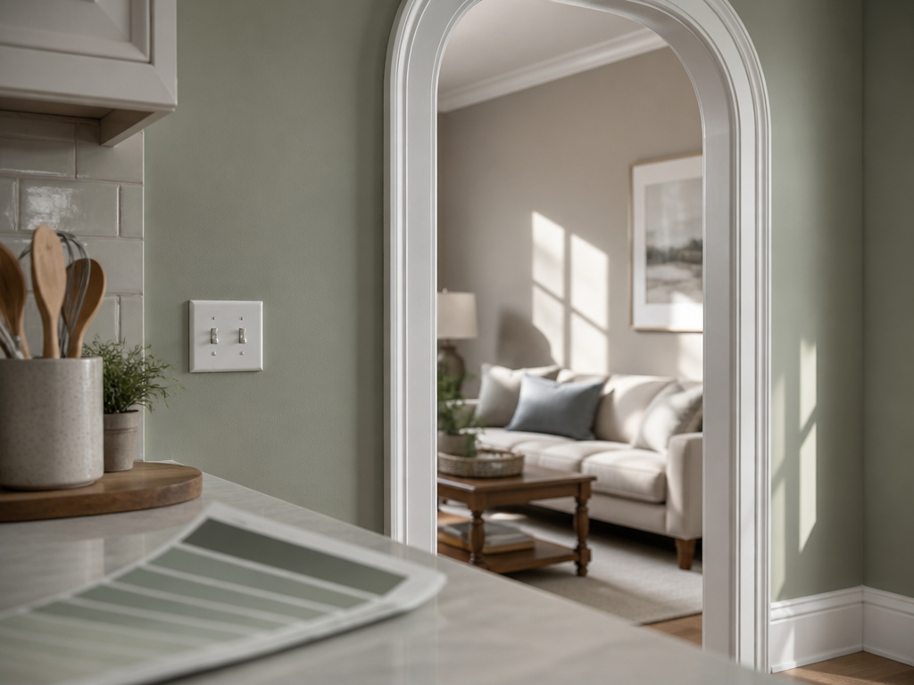
In an open plan, most of the palette is visible at once, so every choice has to survive being seen beside every other choice.
Houzz’s answer is shades or tints of the same hue, and Gaskill notes this works especially well when much of the house is visible at once. This Old House says much the same from the other direction: similar undertones throughout an open floor plan create flow. Tami Ridgeway, a color stylist for Valspar, adds that muted, dustier values move more smoothly from one area to the next.
Zoning is the exception. This Old House suggests one color for the kitchen area and a complementary color for the adjoining living space, held together by a consistent trim color. That’s the practical version of open floor plan colors that don’t fight each other across an archway.
Trim and Doors: One White or a Supporting Cast?
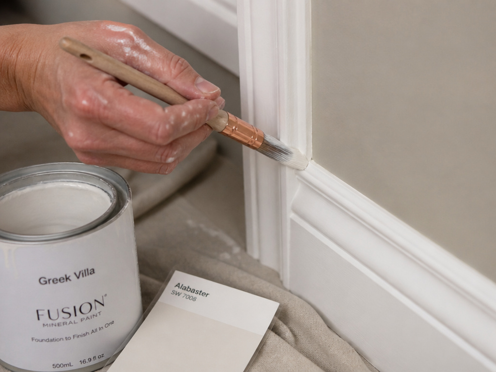
Sherwin-Williams recommends one neutral color on all trim and doors, and the same discipline for white: find a white you love and use it every time you paint something white.
Benjamin Moore treats trim as a supporting role instead, with warm and cool options chosen per aesthetic. Swiss Coffee OC-45 for a comforting look, Ice Mist OC-67 for something more modern.
One White or Several?
Architectural Digest lands closer to Sherwin-Williams. Leah Alexander says once you settle on a white, all the whites in the house should be that hue, and names Greek Villa HGSW7551 and Alabaster HGSW7008 as whites that aren’t too stark and don’t read blue.
The compromise most painters land on: one white for trim and doors, and let the walls do the varying. Sheri Thompson of Sherwin-Williams suggests painting molding or doorways one step lighter or darker than the wall for a subtle shift that pulls the eye to the detail. I’ve stopped buying a separate white for every room, and nobody has noticed.
White is also the easy answer for ceilings, since it reflects light and makes a room feel more spacious. A colored ceiling is a different tool: it lowers the perceived height of a tall room, while a pale ceiling in a room with standard 8- or 9-foot ceilings soothes without closing in. If the trim is staying wood, wall colors with wood trim is a separate calculation from anything painted.
Frequently Asked Questions
How many colors should a whole house palette have?
Benjamin Moore’s palette page says six or seven hues, and its Color Handbook says three to five. Both are manufacturer guidance, and neither is enforced. A workable middle: one dominant, a few secondary, one trim, one accent.
Should every room in the house use the same white trim?
Sherwin-Williams says yes in spirit: one neutral on all trim and doors, and one white used every time you paint something white. Leah Alexander of HGTV Home by Sherwin-Williams makes the same case in Architectural Digest, naming Greek Villa HGSW7551 and Alabaster HGSW7008 as whites that don’t read blue.
Can I mix warm and cool colors in one house?
Leah Alexander advises picking one temperature and sticking to it, because mixing reads as jarring. Benjamin Moore instead suggests judging warm versus cool per room by direction and light. A practical split: one temperature per sightline, and a different mood on a separate floor if the floors are closed off.
Where should I start if I only want one bold room?
Houzz’s Laura Gaskill suggests starting with the boldest room and choosing softer colors as you move outward. She warns that bold next to bold carries more risk. Margaret Naeve Parker limits a bold differing room to a dining room or study to keep the house from feeling busy.
Do I need primer if I’m painting over a dark color?
Yes. Michael Baillie of The Home Depot tells This Old House that primer prevents the previous wall color from interfering with the new one. Ask the paint counter to tint the primer toward your topcoat to keep the previous wall color from interfering with the new one.
The Bottom Line
A day or two on a 4-by-4-foot swatch is the guideline. If the color still looks wrong after that, blame the room’s light before you blame the paint, and start the hue over.
The mechanics of how to create a whole house paint color scheme are the easy part. Four roles, a ratio, one white for the trim. The hard part is trusting a big, unglamorous square of poster board over a pretty chip.
With supplies you already own: paint two poster board squares with your top two candidates, tape them side by side on the wall, and look at them in different lighting and times of day. Pick the one that survives both.
Give yourself permission to experiment. The worst outcome is a repaint, and you were going to repaint anyway.
