
Complementary Colors in Painting: Mixing That Works
This post contains affiliate links. As an Amazon Associate, we earn from qualifying purchases.
Complementary colors in painting are pairs that neutralize each other when mixed, and the physical definition is simple: two paints are complementary if their mixture yields a neutral black, gray, or white. PaintPRO Magazine defines complements as colors opposite each other on the color wheel, such as red and green or blue and orange, while Springer notes that the ‘opposite on the color circle’ claim is often made without justification.
That neutral result is the useful part of the complementary colors in painting question. A complement knocks the brightness out of a color without reaching for black, and it makes a shadow that belongs to the object casting it. PaintPRO Magazine says equal parts of complements give a neutral gray, while the Harding University handout says even true complements are somewhat off-hue, so the actual paint may give you something warm, cool, or faintly green.
What follows: the two definitions worth knowing, the three complement classes Cabot lists in its technical bulletin, a mixing method that survives real pigments, and the one place where a manufacturer says skip the complement entirely.
Key Takeaways
- Two definitions exist for complementary color: physical (mixture yields neutral) and phenomenal (afterimage hue match). They are not interchangeable.
- The Harding University handout says even true complements are somewhat off-hue, so your best neutral will lean slightly warm or cool, while PaintPRO Magazine says equal parts of complements give a neutral gray.
- Record your proportions as you mix (60/40, 50/50) because the Harding handout says the ratio reflects tinting power and must be found by experimenting, while PaintPRO Magazine says equal parts of complements give a neutral gray.
- Benjamin Moore advises against complement-mixing for exterior colorants that pair YW, RD, or OG with TG or BB. Use BK or GY instead.
- Wait until the paint is completely dry before judging color. A 1-by-1 inch chip looks much darker on a large wall.
What Do Complementary Colors Actually Mean in Painting?
The Springer complementary colors entry lists two accepted definitions, and they do different jobs. The physical definition is about mixture. The phenomenal definition is about afterimages. Both can be demonstrated.
Two definitions of complementary color are widely accepted. In the physical definition, two paints, inks, or colored lights are complementary when their mixture yields a neutral black, gray, or white. In the phenomenal definition, two colors are complementary when the afterimage of one matches the hue of the other.
The physical version is the one that matters when you’re standing at a mixing table with a palette knife. You can test it. Mix two pigments and see whether the result goes neutral. The phenomenal version describes what your eye does after staring at a color, which is a separate experiment from the complementary colors in painting one.
Springer also notes that it’s common to simply claim colors opposite each other on a color circle are complementary, without further explanation. That shortcut is everywhere in beginner guides. It’s useful as a starting point and shaky as a rule.
If you want the fuller picture, the color theory for painters piece walks through hue, value, and chroma before you ever touch a tube. The short version: hue is the name, value is how light or dark, and chroma is how saturated. The Munsell System uses exactly those three dimensions, per PaintPRO Magazine.
Why the Color Wheel Is a Starting Point, Not a Rule
The wheel is a map, and every map leaves things out. PaintPRO Magazine defines complementary colors as colors opposite each other on the wheel, such as red and green or blue and orange, while Springer notes that the ‘opposite on the color circle’ claim is often made without justification.
Here’s what the wheel doesn’t tell you.
- Where the wheel came from. Source colors can be based on the Munsell wheel or the Rood wheel, and they don’t place hues in identical spots.
- That even true complements are somewhat off-hue. The Harding University color course handout says the best neutral you can mix will still lean warm or cool, while PaintPRO Magazine says equal parts of complements give a neutral gray.
- That the ratio isn’t fixed. The Harding handout says different brands and product lines vary in hue, tinting power, and opacity, so the same 50/50 mix gives different results on different tubes, while PaintPRO Magazine says equal parts of complements give a neutral gray.
- How the paint behaves when wet. Color shifts as it dries, especially water-based products.
That last point is where beginners get burned. You mix what looks like a perfect warm gray, it dries darker, and you spend time trying to walk it back.
Color also depends on light. The NIST color in daily lives report puts it plainly: if an object appears black, its colorants have absorbed all or most of the light. If most light is reflected, it appears white. A swatch under a desk lamp at night reads warm and wrong. The same swatch by a north window in daylight reads closer to what you’ll actually get.
The color wheel for painting guide covers the mechanics of reading one without treating it as law. Use it to pick a direction, then trust the swatch.
How Do You Mix a Neutral Gray From Complements?
What happens when you mix two complements and the result comes out slightly green instead of gray? That’s the normal outcome, and the Harding University complementary mixing handout treats it as expected rather than a mistake.
The method is straightforward. Mix pairs of complements or near-complements, aiming for the lowest chroma you can reach, which means the result closest to pure gray. Then note the approximate proportions you used (60/40, 50/50) next to the sample. That number tells you the relative tinting power of the two pigments.
When I started painting, I squeezed color straight from the tube and put it down unmixed. I thought that was what painters did. Then I mixed two pigments together for the first time, watched the color soften, and realized I’d been painting with the volume knob at maximum the whole time.
Before you start: Oil-based colorants and their solvents need ventilation, so crack a window and keep nitrile gloves on. Pigment stains under the fingernail linger, and solvent contact dries skin fast.
- Pick two complements or near-complements from your wheel, one warm and one cool if you can. Skipping the warm/cool check means you’ll mix two pigments leaning the same direction and get mud.
- Mix small amounts on a scrap and add the darker pigment in tiny increments. Dumping in a full brushload at once overshoots the neutral and you’ll spend time adding paint back.
- Stop when the chroma drops, not when the hue vanishes. Waiting for a perfect gray means you’ll keep adding pigment until the mix turns to mud.
- Write the ratio next to the swatch (60/40, 50/50) so you can repeat it. Without the number, the next batch won’t match and you’ll be guessing.
- Add a third hue only if chroma is still too high, choosing a color that complements whatever hue is still prominent. Adding a third pigment too early flattens the color and you lose the ability to adjust.
The Two-Hue Neutral
Two pigments will get you a usable gray. The Harding handout says to aim for the lowest chroma possible, which means the sample closest to pure gray with the least warmth or coolness. Even then, Harding says true complements will be somewhat off-hue, so the best neutrals possible are likely to be somewhat warm or cool, while PaintPRO Magazine says equal parts of complements give a neutral gray.
Stop when the chroma drops, not when the hue vanishes.
The Third Hue Correction
When chroma is still too high after two pigments, Harding recommends adding a third hue that complements whatever hue is still prominent in the mixture. That’s the correction step, not the starting point. Paint three tones of your best two-color neutral: a value 4 (fairly dark, may need black), a value 6, and a value 8 tint.
Common mistake: Mixing four or five pigments to chase a color. Benjamin Moore’s guidance caps most matches at three colorants plus white, and every extra pigment narrows your ability to adjust.
If you want a deeper walkthrough of neutral mixing, the mixing gray paint guide covers warm and cool grays and when each one belongs in a shadow.
Where Sources Disagree on Neutralizing a Color
Four sources, four different answers on how to knock the brightness out of a color. The disagreement is real and worth seeing side by side, because the right answer depends on whether you’re mixing on a canvas or tinting exterior stain.
| Source | Recommended method | Where it applies |
|---|---|---|
| Benjamin Moore | Use BK or GY instead of complement pairs | Exterior products with YW, RD, or OG |
| HUD / ICS Painting Part 3 | Add a small amount of the complement | Interior wall color, backgrounds |
| Harding University handout | Mix complements, then add a third hue | Studio paint mixing, low-chroma neutrals |
| PaintPRO Magazine | Mix equal parts of complements | General color theory, neutral gray |
Benjamin Moore’s guidance is the most specific and the most surprising. The manufacturer warns against opponent color matches that use YW, RD, or OG colorants in combination with TG or BB in exterior products, because those combinations result in gray. Use BK or GY instead.
HUD’s Painting Part 3 says the opposite for interior work: any color can be grayed by adding black, white, or, better still, a small amount of the complementary color. Grayed colors are generally best for backgrounds.
Both can be right. Exterior colorants have to survive sunlight and weather, and Benjamin Moore is protecting durability. Interior wall color doesn’t face that test, so the complement route stays open.
Brown is an example of a color that can benefit from a complement pair. The mixing brown paint guide covers the routes that keep it from going flat.
If you’d rather skip the complement entirely, the mixing black paint guide covers what black does to a mix and when a complement gives you more control over the final hue.
True, Split, and Alternate: The Three Complement Classes

Cabot’s 2008 technical bulletin names three classes of complement: True, Split, and Alternate. The distinction matters because “complementary” in casual speech usually means True, and the other two show up constantly in real palettes.
| Class | Definition | Practical effect |
|---|---|---|
| True | Directly opposite on the wheel | Maximum contrast, maximum vibration |
| Split | Either side of the true complement | Softer contrast, less visual clash |
| Alternate | Two steps from true | Weakest contrast of the three |
PaintPRO Magazine describes split complements the same way: pick one color and use the colors on each side of its complement, such as blue with red-orange and yellow-orange. That pairing gives you contrast without the full jump of a true complement.
Alternate complements sit two steps from true, and Cabot doesn’t give a worked example in the bulletin. The practical read: if True feels too sharp and Split feels too close, Alternate lands in between. Most palettes use all three.
I’ve stopped using true complements for shadows on skin tones. The split pair reads more natural every time, and I don’t spend time fighting a shadow that looks painted on.
Split complements earn their keep in shadows and highlights, where a straight complement can make a shadow look pasted on and a split pair reads as natural.
Testing Color Before You Commit to a Wall or Canvas
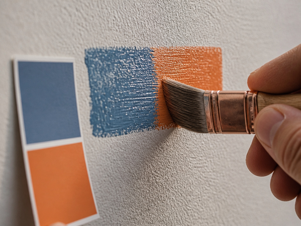
You hold the chip against the wall, and it looks perfect. After coating it looks like a different color. That’s not a fluke, and two separate sources warn about it.
Cabot’s technical bulletin is blunt: never rely solely on a small chip to determine a final color choice. A color chosen from a one-by-one inch sample will look a lot darker when applied to a large surface. HUD’s Painting Part 3 says colors are usually selected from color cards or by painting small wall areas, though such small areas are deceiving because color intensifies with area and reflectance.
Cabot’s fix is to brush out a sample on the actual surface, then wait, while HUD notes that colors are usually selected from color cards or by painting small wall areas.
Brush Out, Don’t Trust the Chip
Cabot says a sample of the chosen color should be brushed out on the surface to which it will be applied. Exterior stains should be viewed under daylight conditions, because pigments absorb and reflect different wavelengths of light under different sources. A desk lamp at night is a poor judge.
The mixing paint colors guide covers how to build a swatch you can actually judge, which is a different skill from mixing the color itself.
Wait for Dry
Cabot says no color decision should be made until the product is completely dry, because colors change as they dry, especially latex or water-based products. The first coat of a two-coat system will usually appear darker than the second.
The old government standard is stricter than most hobbyists expect. The artists oil paints technical report, NBS Commercial Standard CS98-42, requires artists’ oil paints to dry to both sand and pressure tests within 21 days and not under 3 days at 78 degrees F and 55 percent relative humidity. That’s the NBS standard’s definition of “dry,” and it’s a useful reminder that the word covers a wide range.
Where this goes sideways: Judging a water-based color while it’s still wet. Latex and acrylic paints shift noticeably as they dry, and the first coat of a two-coat system reads darker than the second. Wait until it is completely dry.
Comparing two colors by eye is one thing. Comparing them by instrument is another, and the ASTM D2244 color tolerance standard warns that color differences should only be compared within the same color-scale system. There’s no simple factor to convert accurately between systems for all colors.
Wait for it.
If a mixed gray looks perfect on the palette, check it again once it is completely dry. Wet paint lies about value.
Frequently Asked Questions
Are complementary colors always opposite each other on the wheel?
No. The Springer encyclopedia notes two accepted definitions, physical and phenomenal, and says the “opposite on the color circle” claim is often made without justification. The wheel version is a useful shortcut, not a complete definition.
Why does my mixed gray look green?
Even true complements are somewhat off-hue, per the Harding University handout, so the best neutral you can mix will lean warm or cool. A green cast usually means one pigment was carrying more yellow than the wheel suggested.
Do I need equal parts of each color to make gray?
Not necessarily. PaintPRO Magazine says equal parts of complements give a neutral gray, while the Harding handout says the correct proportions can only be found by experimenting because brands vary in tinting power.
Can I use black instead of a complement to gray a color?
Yes, and HUD’s Painting Part 3 lists black, white, or a small amount of the complement as options. The complement route gives you more control over the final hue, while black tends to flatten it.
Why does my exterior color look wrong in photos?
Cabot’s bulletin says exterior stains should be viewed under daylight conditions because pigments absorb and reflect different wavelengths under different light sources. A desk lamp at night is a poor judge.
The Bottom Line
Here’s the first step I’d give anyone starting this week: mix a two-pigment gray, write the ratio next to it, and stick the swatch in your sketchbook. Do that with several different pairs and you’ll learn more about saturation than any color wheel poster can teach.
The concession: none of this replaces the manufacturer’s guidance on exterior colorants. If you’re tinting stain or exterior paint, follow Benjamin Moore’s warning and skip the complement combos that use YW, RD, or OG with TG or BB. Studio mixing and exterior durability are different problems.
And the contrarian bit. A muddy gray is not a failure. It’s the most useful color on your palette, because it teaches you where the edge of saturation sits. I’d rather see a sketchbook full of near-neutrals than one perfect swatch you’re afraid to touch.
Try it on a scrap first.
