
How to Mix Purple Paint: 2 Colors, No Mud
This post contains affiliate links. As an Amazon Associate, we earn from qualifying purchases.
To mix purple paint, combine a red and a blue, then adjust: more red pushes the mix toward plum, more blue pushes it toward indigo, and a touch of white turns it into lavender. Keep to two pigments plus white. Every extra color you add dulls the result.
The red you pick sets the whole outcome. A warm red leaning orange drags the mix toward brown the moment blue joins it. A cool red leaning blue keeps the purple clean and bright. That one choice does more work than any how to mix purple paint ratio you’ll read online.
What follows is the two-pigment method, the five-step order that keeps a mix clean, and the ratios that catalyzed coatings actually print on the cup.
Key Takeaways
- Pick one red, not two. A warm red and a cool red in the same puddle fight each other and the purple goes flat.
- Two pigments plus white is the ceiling. The third pigment is what turns purple to mud.
- Ultramarine plus a cool red gives the cleanest violet. Phthalo blue drags it toward teal.
- Catalyzed coatings follow the printed cup grid. Matthews Paint builds its mix on a 3:1:1 paint, catalyst, reducer ratio by volume.
- Stir for 60 seconds or until the mixture is visually homogeneous, then stop.
Why Your Red Choice Decides the Purple
Every purple you mix starts as a negotiation between one red and one blue.
Purple sits between red and blue on the spectrum, so any mix of the two lands somewhere in the violet range. The exact landing point depends on which side of red and which side of blue the chosen pigments sit on. Warm reds carry orange undertones; cool reds carry blue ones.
Now watch what happens when you pair a warm red with a green-leaning blue. The orange undertone in the red meets the green undertone in the blue, and the two partly cancel each other out. What’s left reads as a dull reddish gray.
You’ll see the chroma drop before the value changes. The puddle goes flat and slightly chalky at the rim while the middle still looks purple. That’s your warning, and it shows up fast.
Warm Red vs Cool Red: What Changes on the Page
Sort your reds before you squeeze anything. The difference is visible on the palette, not just in a book.
- Warm reds lean orange: cadmium red, napthol red, vermilion. They push purple toward plum and brick.
- Cool reds lean blue: alizarin crimson, quinacridone magenta, permanent rose. These hold a clean violet.
- Magenta is the wildcard. It’s already halfway to purple, so it needs very little blue.
A cadmium red hue is a warm red and behaves like one. Ultramarine is a warm blue. Put those two together and you get a soft, slightly dusty violet that suits skies.
Which Blue Pushes Purple the Right Way
Blue choice matters as much as red choice, and it gets less attention.
Ultramarine is the forgiving one. It leans violet already, so it meets a cool red in the middle and the purple comes out clean. Phthalo blue is the opposite: strong, green-leaning, and it will pull your purple toward teal if you overdo it. Cerulean sits between them and gives a softer, grayer violet.
If you want the full map of which colors sit next to which, a color wheel is worth ten minutes of study.
Start blue-heavy. Add red in small touches.
How to Mix Purple Paint: The 5-Step Order
Five steps, and the order matters more than the quantities.
Before you start: Acrylics and oils are low-hazard but not no-hazard, so ventilate the room and keep paint off your skin during long sessions. Catalyzed coatings are a different animal. Matthews Paint states its materials are designed for trained professionals using proper equipment and are not intended for sale to the general public. Read the SDS and the label before you open anything.
- Squeeze out blue first. Put a small mound of blue on the palette and leave space beside it. Starting blue-heavy means you add red to a known quantity instead of chasing a mix you already overcommitted.
- Add red in touches, not squeezes. Dip the tip of the brush or the corner of the palette knife. A little red goes a long way, and you can always add more.
- Fold the paint over itself until the streak disappears. Circular stirring whips in air and leaves streaks you’ll later mistake for a color shift.
- Test on scrap paper before you commit. Acrylic dries darker than it looks wet, and oil shifts as the binder settles. The wet puddle lies to you.
- Only then add white, and add it last. White lifts the value and drops the saturation at the same time. Add it early and you’ll spend the rest of the mix trying to get the chroma back.
I keep a mixing chart taped inside the back cover of my sketchbook, and it’s saved me more times than any book. Every time a purple works, I paint a square of it and write the two tube names underneath. A few pages of squares and I stopped guessing.
Try it on a scrap first. That’s the whole trick, and it costs you almost nothing.
The broader logic of mixing paint colors works the same way: fewer tubes, more tests.
The Ratio Question: What’s Documented and What Isn’t
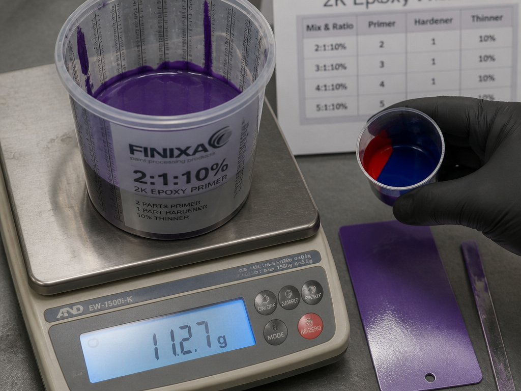
Matthews Paint prints its mix ratio directly on the side of the mixing cup.
That’s the honest state of things. Nobody publishes a red-to-blue ratio for purple, because the right number depends on which red and which blue you’re holding. What does get published is the ratio between paint, catalyst, and reducer, and that answers a different question.
| Source | What it fixes | Value |
|---|---|---|
| PPG PD-0631 | Spray-out card quantity | 66 parts / 68 g / 1.8 oz per ARMC XXX card |
| Matthews MPC224 | Paint : catalyst : reducer | 3:1:1 by volume |
| Matthews MPC224 | Scaled batches | 6:2:2 or 9:3:3 |
| Matthews MPC224 | Stir time | 60 seconds or until homogeneous |
| NBS C13 | Body-coat thinner | 1 pint per gallon of paint |
| NIST T274 | Semipaste density | About 20 lb per gallon |
Read that table for what it is. Every row governs how a coating behaves once it’s mixed. None of them tells you how much red to add, and pretending otherwise is how people end up with a batch they can’t spray.
The one number that does touch color is PPG’s spray-out quantity. When a color match looks suspicious, PPG’s procedure is to mix a small amount on the scale for a spray-out card rather than commit to a full job batch. That’s the same instinct as testing on scrap paper, just with a scale and a formula code.
The Mistake That Turns Purple to Mud
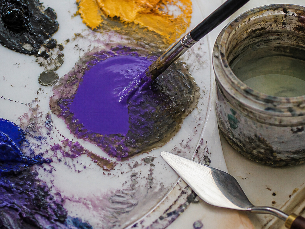
Three pigments is where purple dies.
The third pigment is almost never blue or red. It’s whatever was already on your brush, or a dot of yellow added to “warm it up,” or black reached for because the purple looked too bright.
Common mistake: Darkening purple with black. Black is a pigment in its own right, and it drags the hue toward gray-brown within a stroke or two. The purple stops reading as purple at all.
Yellow is the faster killer. Yellow sits opposite purple, so the two neutralize each other and you get a dull brown. That’s useful when you’re mixing brown paint on purpose. It’s a disaster if you wanted violet.
Green does the same thing from the other side. A dirty water jar is the usual culprit, because leftover green paint from the last mix neutralizes purple on contact.
Rinse between every mix. Every time.
There’s a version of this worth doing deliberately. Mixing a muddy gray-violet on purpose teaches you where the saturation cliff is, and after a few of those you can feel a mix going flat before you see it.
How Do You Mix Purple in a Catalyzed Coating?
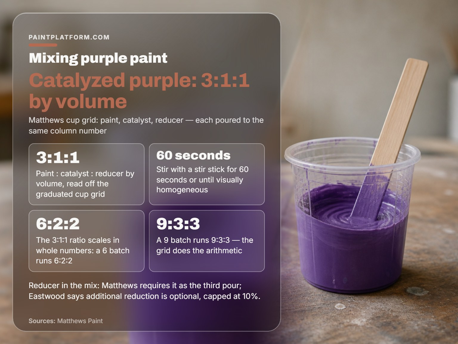
You don’t build it by eye. You pick the formula, then follow the cup grid.
| Question | Artist acrylic or oil | Catalyzed coating (Matthews) |
|---|---|---|
| Where the ratio comes from | Your eye, on the palette | The printed cup grid |
| What you adjust for color | Which red, which blue | The formula code on the work order |
| Stir time | Until it looks even | 60 seconds or until homogeneous |
| Who it’s for | Anyone with a brush | Trained professionals only |
Matthews builds its mix as 3:1:1 by volume: paint, then catalyst, then reducer, each poured to the matching number in the same column, while Eastwood holds that additional reduction is not required and is optional, capped at 10%. It scales in whole numbers, so a 6 batch runs 6:2:2 and a 9 batch runs 9:3:3. The grid does the arithmetic so you don’t.
The color itself comes from the formula, not from a color wheel. PPG’s procedure starts with the OEM color code and a variant check under natural sunlight, color-corrected lights, or a handheld portable color matching light. Polish the adjacent panel first so you’re comparing against a clean surface.
PPG also draws a line between a verified match and a suspicious one. A verified match gets mixed at full job quantity. A suspicious one gets a small batch first, so a wrong guess costs you a card instead of a job.
When the Cup Grid Doesn’t Apply
Artists don’t need any of this, and it’s worth saying plainly. A tube of single-pigment dioxazine purple is already the color. You aren’t building it from red and blue, and no grid will help you.
Where the industrial procedure does transfer is the discipline: verify before you commit, and mix small until you’re sure.
Stirring and Straining: The Steps Everyone Skips
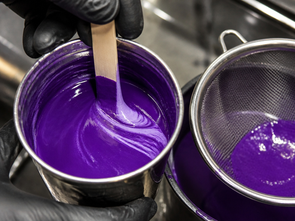
You’ve got the color right. You stir it once, load the brush, and the first stroke comes out streaky.
Two documents describe this step, and they don’t agree on the tool. Matthews specifies a stir stick and 60 seconds, or until the mixture is visually homogeneous, while Eastwood permits a mixing wand chucked into a power drill. The older NBS bulletin specifies a stout paddle, with the settled pigment worked up first and the clear liquid poured back in stages until all of it is incorporated. Both are describing the same job on different products.
The government report on paint preparation is blunt about the second half of the job too: paints should always be mixed and strained before use.
Stir until you can’t see a streak, then stir a little longer. The streak you can see is the one you caught; the one you can’t is the one that lands on the panel.
For thinned house paint the older references give specific figures. NBS lists one pint of turpentine or mineral spirits per gallon for body coats, and no thinner at all for finish coats. The NIST specification paints technical paper makes the same point and adds a rule people skip: no drier in ready-mixed paint.
Should You Lighten Purple With White or With Gray?
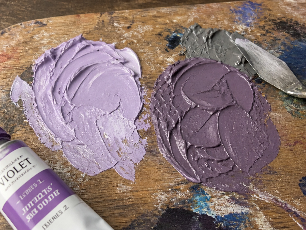
White if you want lavender. Gray if you want the purple to stay purple.
White does two things at once. It raises the value and it drops the saturation, so a strong violet turns pastel and slightly chalky. That’s fine for skies and flowers. It’s wrong when you wanted a deep muted purple.
Gray is the better tool for that job. A little gray paint knocks the brightness down without lifting the value, so the purple stays purple and just gets quieter. If you want to go darker still, black paint works, but only if you pick it up on the tip of a knife and mix it through completely.
- Lavender: white, small touches, added last.
- Aubergine: a cool dark blue before you reach for black.
- Dusty violet: gray, not white.
- Warm plum: a warm red, not yellow.
Lightening Without Chalk
Chalkiness comes from over-thinning the pigment load. If your lavender looks dusty rather than soft, you’ve added too much white for the amount of paint underneath. Scrape half the mix off the palette and rebuild it with more of the base violet.
A strong single-pigment violet is strong enough to take a lot of white before it goes chalky. A weaker violet folds much sooner.
Add white last, and add less than you think.
Frequently Asked Questions
What two colors make purple?
Red and blue. The exact shade depends on which red and which blue you choose, because a warm red with a green-leaning blue lands closer to gray than to violet. Start with a cool red and ultramarine if you want a clean result.
Can you mix purple from primary colors only?
Yes, as long as your primaries are a warm red and a cool blue. Most beginner sets pair a warm red with a green-leaning blue, which is why the purple comes out muddy. Add a cool red to the set before you add another purple.
Why does my purple keep turning brown?
Third pigment got in. Yellow is the usual suspect, either added deliberately or picked up from a dirty brush. Black does the same thing more slowly. Rinse between mixes and keep to two pigments plus white.
How do you make purple darker without black?
Use a cool dark blue, or a small amount of a deep single-pigment violet. Black works but it pulls the hue toward gray-brown, and it does it fast. Add dark colors on the tip of a knife so you can control the amount.
Should you buy a purple tube instead of mixing one?
For a single-pigment violet like dioxazine, yes. It’s consistent, it’s strong, and you skip the guessing. Mix your own when you need a specific temperature or a color that sits between two tubes you already own.
The Bottom Line
If your purple goes gray within a minute of mixing, stop adding and start over with a clean brush and a clean water jar. That one habit fixes more muddy purples than any ratio will.
The honest limit of all this: color mixing is trial and error wearing a set of rules. I don’t have formal color theory training, and my explanations lean on what happened on the paper rather than what a textbook says. If you want rigorous technical grounding, go get it. If you want to make a purple today, two pigments will get you there.
That’s how to mix purple paint in practice. One red, one blue, white last, and a scrap of paper to test on before you commit to anything bigger.
Start messy. You can refine a purple. You can’t refine a puddle you never made.
