
How to Choose an Accent Wall Color: Step-by-Step
This post contains affiliate links. As an Amazon Associate, we earn from qualifying purchases.
To choose an accent wall color, start with the 60/30/10 split: 60 percent main color, 30 percent secondary, 10 percent accent. Pick one or two accent colors at most, test them on a foam-core board through the day, and match the shade to the room’s light before you commit to a gallon.
The 10 percent slice is where an accent wall succeeds or fails. That number is small on purpose. A single wall of color can carry a whole room, and a second accent color tends to split the attention instead of doubling the effect. Knowing how to choose an accent wall color helps you get that balance right.
What follows: how to pick the wall, how to test a color before you buy, the narrow-room rule two big paint companies disagree on, and the walls where an accent wall quietly makes a room worse.
Key Takeaways
- Stick to one or two accent colors. BEHR PRO recommends no more than that, and the 60/30/10 split leaves just 10 percent for the accent.
- Test on a foam-core board, not the wall. Paint a sample board and move it around the room through the day so you catch the shift.
- Pick the wall your eye lands on. The focal point or the longest uninterrupted wall, not whichever wall happens to be empty.
- Avoid slanted ceilings and window-heavy walls. They break up the elevation and fight the color.
- Match the shade to the room’s light. The same chip reads differently at noon and at dusk.
The 60/30/10 Split That Decides How Much Color You Actually Need
BEHR PRO publishes a simple rule of thumb for dividing color in a room: 60 percent main color, 30 percent secondary, and 10 percent for the accent.
The 60/30/10 rule assigns 60 percent of a room’s color to the main wall shade, 30 percent to a secondary color, and the remaining 10 percent to the accent color or colors. BEHR PRO recommends no more than one or two accent colors in a single space, which keeps the accent from competing with the main palette.
That 10 percent is smaller than it feels in the paint aisle. A single accent wall in a normal living room already fills that budget. Adding a second accent color is where most rooms start to feel busy.
The Spruce offers one way past two colors without breaking the rule: an ombre effect using different shades of the same color, gradually getting darker around the room. Benjamin Moore’s own ombre example uses Green Grove 2138-20 on the base molding, Briarwood HC-175 on the lower wall, and Bleeker Beige HC-80 on the upper wall. Same family, three values.
I learned the value of that limit on canvas. For years I owned dozens of tubes and mixed muddy color after muddy color. These days I work from a handful of pigments and the harmony is almost automatic. Fewer choices made me braver, and the same thing happens when you limit a room to one accent.
If you’re still mapping out the base palette, the paint colors for the whole room come first, and how to choose an accent wall color is the last decision, not the first.
Which Wall Should Get the Accent Color?
Which wall in the room actually earns the color? The answer is usually the one your eye lands on when you walk in, not the one that happens to be empty.
The Focal Point Test
The Spruce calls this the focal point: the wall or area that first grabs your attention when you step inside. A YouTube designer frames it the same way, with a second option: the longest uninterrupted wall in the room. Either works. What doesn’t work is picking the blank wall because it’s the only one without furniture on it.
That’s the mistake I see most. (I’ve made it myself, painting a wall in a rental because it was the only one I hadn’t covered with shelves.) The color landed on a wall nobody looked at, and the room read exactly the same afterward.
The Longest Uninterrupted Wall
If no wall grabs you, the longest unbroken stretch is the fallback. It gives the color a clean start and stop, which is what a feature wall needs.
An accent wall should support the focal point you already have, not compete with it, which is the heart of how to choose an accent wall color. If the fireplace is the star, the wall behind it is the natural home for color. If the room’s anchor is a sofa, the wall behind the sofa is the target.
Common mistake: Choosing the accent wall by which one is empty. An empty wall has no focal point, and the color won’t fix the fact that nobody’s looking at it.
Where the color should go is its own argument. The Spruce says the accent color should also show up in the room’s decor to integrate the wall. Farrow & Ball’s Charlotte Cosby takes a different angle: an accent color doesn’t need to be just on the wall, and trims, ceiling, or furniture can carry it instead. Both are worth trying before you commit a whole wall.
If you want to go deeper on the painting step itself, the accent wall guide covers taping, cutting in, and the roller technique that avoids lap marks.
How Do You Test a Color Before It Touches the Wall?
You’re standing in the aisle holding four paint chips, and every one of them looks right. The aisle lighting is lying to you.
Benjamin Moore’s Color Handbook prescribes a physical test: buy a sample, paint a foam-core board, and move it around different parts of the room. Monitor how the color changes at different times of the day so there are no surprises. A board beats a wall swatch because you can walk it to the north corner, then the south, then hold it next to the sofa.
Here’s the sequence that actually works:
- Buy a sample pot, not a gallon. Benjamin Moore sells samples specifically so you can experience the color in real time, from morning to night.
- Paint a foam-core board. Foam core is rigid, cheap, and easy to move. A foam-core board gives you enough surface to judge the color honestly.
- Move the board around the room. Check it against the trim, the floor, and the biggest piece of furniture in the room.
- Watch it across a full day. Morning light, afternoon light, and the warm incandescent bulb after dark all pull the same chip in different directions.
Sherwin-Williams puts it plainly: the color you choose may look different at various times of the day and night, and the warm tones of incandescent lights will have a different influence on the color than the natural light of day.
That’s the part most people skip. The chip you loved at 10am can read gray-green under the kitchen bulb and clean blue by the window.
If you want to go further than a sample board, test paint colors on the wall itself with a peel-and-stick swatch before you commit.
The Narrow-Room Rule Two Paint Companies Disagree On
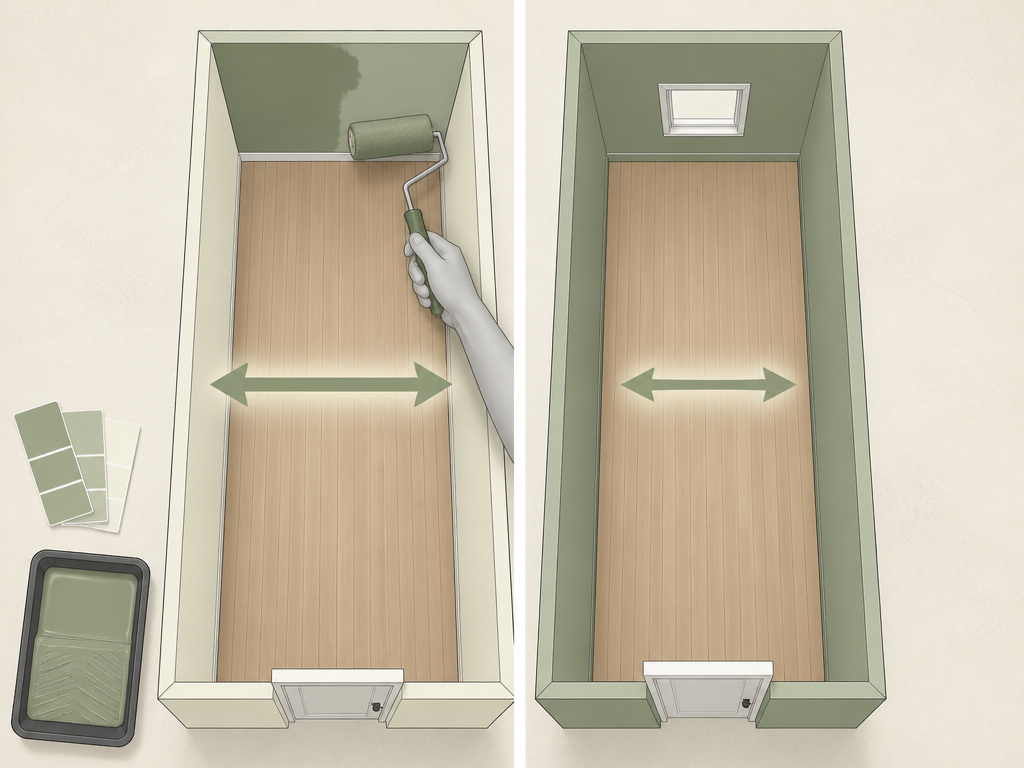
Sherwin-Williams and Farrow & Ball give opposite advice for the same room.
Sherwin-Williams says a long narrow room will look wider if you use a slightly darker color on the shorter walls and a lighter color on the longer walls. That’s a directional tactic: it pulls the short walls toward you and pushes the long walls back.
Farrow & Ball’s Charlotte Cosby, quoted in Apartment Therapy, argues the opposite for a specific case. In a long narrow room with doors or windows on the short walls, she says painting all four walls the same color is best, because an accent wall will close in the space and make it feel longer and narrower.
Both positions are real. They just assume different room layouts. If the short walls are solid, the Sherwin-Williams tactic has somewhere to work. If the short walls are broken up by doorways and windows, the Farrow & Ball approach avoids fighting the openings.
| Question | Sherwin-Williams | Farrow & Ball (Cosby) |
|---|---|---|
| Long narrow room | Darker on short walls, lighter on long walls | All four walls the same color |
| Assumption | Short walls are solid | Short walls have doors or windows |
| Effect | Room reads wider | Room reads less closed-in |
I’d add one practical note. If you can’t decide, paint all four walls the same color first. You can always add an accent later. You can’t un-paint one as easily.
For small rooms where the geometry is the whole problem, paint colors for small rooms covers the light-versus-dark trade-off in more detail.
Light Changes Everything
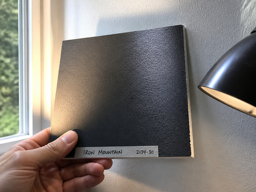
North-facing rooms and south-facing rooms pull the same paint chip in different directions. Sherwin-Williams notes that color shifts by time of day and that incandescent light reads differently than daylight, which means a swatch approved under one source can look wrong under the other.
The practical move is to test under the light you actually live in. If you spend evenings in the room with lamps on, check the board under a lamp. If you’re a morning person, check it at 8am with the curtains open.
I’ve stopped recommending a dark accent on a wall with a window. The color looks great at night and then fights the daylight every afternoon, and there’s no fix short of repainting.
By 4pm the wall behind the window glows like a lightbox and the rest of the room looks dim by comparison, which is exactly the effect The Spruce warns about when a dark accent surrounds a window.
Rooms that never get direct sun need extra care here, which is why north-facing room palettes follow their own logic.
Match the Accent to the Color Wheel
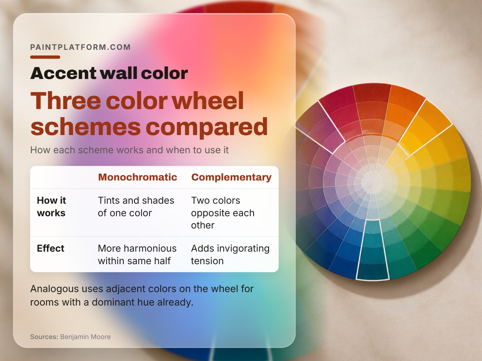
The color wheel gives you three reliable schemes to build from, and Benjamin Moore lays them out cleanly.
The Three Schemes
A monochromatic scheme uses tints and shades of the same color. An analogous scheme uses adjacent colors on the wheel. A complementary scheme pairs two colors opposite each other.
Benjamin Moore’s guidance is that a palette within the same half of the wheel tends to be more harmonious, while pairing two colors opposite one another adds a dash of invigorating tension. Houzz calls the complementary version a high-fashion, high-drama look.
| Scheme | How it works | When to use it |
|---|---|---|
| Monochromatic | Tints and shades of one color | Small rooms, low-risk first accent |
| Analogous | Adjacent colors on the wheel | Rooms with a dominant hue already |
| Complementary | Two colors opposite each other | High-contrast, high-drama rooms |
The pairings that hold up best in real rooms tend to be the ones Houzz names: yellow walls with a cool blue accent, blue walls with a saturated yellow, red paired with fresh white to avoid clashing, and blue-on-blue for people who don’t trust themselves with a hot color yet. Houzz also calls green the easiest dominant color to work with, which makes it a safe base for an analogous accent.
Red is the one to handle carefully. Houzz notes that even when red is applied to just one feature wall, it will feel like the strongest color in the space, so treat it as the dominant hue rather than an accent.
If you want to go deeper on the wheel itself, the color wheel basics cover how to read warm versus cool and where the neutral zones sit.
When an Accent Wall Is the Wrong Move
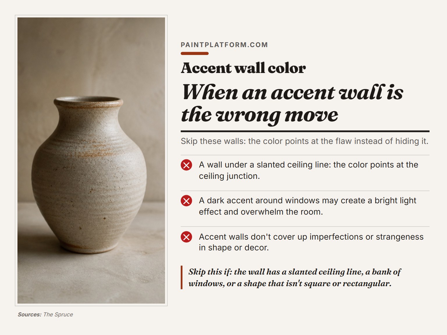
Some walls should never get an accent color, and some rooms shouldn’t have one at all.
The Spruce warns against choosing a wall that isn’t symmetrical, such as one whose shape is impacted by a slanted ceiling. A YouTube designer goes further: accent walls don’t work well in rooms with sloped ceilings, slanted walls, irregular shapes, niches, or alcoves, because the color needs a clean starting and ending point.
Walls with lots of windows, doors, or cutouts are another skip. The Spruce says a dark accent around windows may create a bright light effect that overwhelms the room. The YouTube designer is blunter: don’t create an accent wall on a wall with tons of windows, doors, or cutouts, because it breaks up the elevation and defeats the purpose.
Rooms are the same story. The Spruce says accent walls are widely used in living rooms and bedrooms, and their charm can extend to bathrooms, kitchens, home offices, or even exteriors. The YouTube designer disagrees on bathrooms and kitchens: bathrooms are already small, and contrasting walls reduce the perceived size, while kitchens already have appliances and fixtures competing for focus across different walls.
Skip these walls:
- A wall under a slanted ceiling line. The color points at the ceiling junction instead of hiding it, and you’ll notice that line within a week of living with it.
- A wall broken up by a bank of windows or two doorways. The elevation never reads as one expanse.
- A wall that isn’t square or rectangular. Niches and alcoves break the color’s start and stop.
Skip this if: The wall has a slanted ceiling line, a bank of windows, or a shape that isn’t square or rectangular. The color points at the flaw instead of hiding it.
For feature walls that need texture instead of flat color, specialty paint covers the finishes that hold up in real rooms.
What You Actually Need to Buy
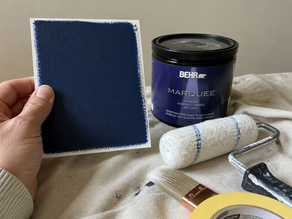
Three things, and one of them is a foam board.
You need a sample pot of the accent color, a foam-core board to test it on, and a roller and brush to apply it. That’s it. The rest is optional.
For the paint itself, choose an interior paint for a single accent wall. It is a practical choice for a single accent wall. If you want a slightly harder finish that cleans up better in a hallway or kids’ room, a more durable paint is worth the step up.
A YouTube painter notes that depending on the paint, an accent wall could require three coats. That’s worth knowing before you buy, because a deep red or a saturated navy will often need the extra pass.
Worth knowing before you start: A 13-inch microfiber roller and a top-to-bottom stroke pattern is what one painter recommends. Yellow FrogTape is the tape some people prefer for straight lines, though a steady hand and a good brush work too.
The trim is its own decision. Benjamin Moore points out that a trim color like Black Satin 2131-10 against a neutral wall is a striking way to showcase architecture, though glossy white remains the classic choice. If you’re picking a trim to go with the accent, the trim color guide walks through the match.
Frequently Asked Questions
How many accent colors should a room have?
BEHR PRO recommends no more than one or two. The 60/30/10 split leaves just 10 percent of the room’s color for the accent, and a single wall usually fills that budget on its own. If you want more color than that, The Spruce suggests an ombre effect using shades of the same hue rather than a third competing color.
Should the accent wall be lighter or darker than the rest of the room?
It depends on what you want the wall to do. The Spruce says a lighter accent wall is more likely to open up the space, while a darker color is more likely to draw attention or make something recede. BEHR PRO frames a single accent wall as establishing a point of focus and a feeling of spaciousness, which is a slightly different claim. Test both directions on a foam board before you commit.
Can I put an accent wall in a small bathroom?
The Spruce says accent walls are widely used in living rooms and bedrooms, and their charm can extend to bathrooms, kitchens, and home offices. A YouTube designer disagrees on bathrooms specifically, arguing that contrasting walls reduce the perceived size of an already small room. If the bathroom is genuinely tight, painting all four walls the same color is the safer call.
Do I need to test the color on the wall, or is a sample board enough?
Benjamin Moore’s method is a foam-core board, not the wall. Paint the board, move it around the room, and watch it at different times of day. A board lets you check the color against the trim, the floor, and the furniture without putting a patch of paint on the wall itself. If you want a wall swatch too, a peel-and-stick sample gets you there without the mess.
What’s the biggest mistake people make choosing an accent color?
Two come up repeatedly. The Spruce warns against choosing a color because it’s trendy rather than because it works with the space. And the most common structural mistake is picking the empty wall instead of the wall your eye actually lands on when you walk in.
The Bottom Line
Here’s the rule I’d hand you if you only get one: pick the wall your eye lands on when you walk in, buy one sample pot, and test it on a foam board for a full day before you buy the gallon.
If the wall has a slanted ceiling line or a bank of windows, stop and pick a different wall. The color points at the flaw instead of hiding it, and you’ll see that every time you walk in.
And if you’re stuck between two shades, go with the deeper version of the color already on the other three walls. It’s the lowest-risk version of an accent wall, and it reads as intentional even when the room lighting shifts at 4pm.
Try this today: grab a foam-core board and a sample pot, paint the board, and set it against the wall you’re considering. Check it at noon and again after dark. Ten minutes, and you’ll know more than any paint chip in the aisle can tell you.
