
How to Choose a Trim Color That Matches Wall Paint
This post contains affiliate links. As an Amazon Associate, we earn from qualifying purchases.
That light reflectance number is the reason two whites can look wrong together even when they sit a chip apart on the same card. A white with a higher value bounces more light back at you, so it reads clean and bright next to a slightly lower one. Flip the order and the trim goes dull while the wall stays bright. This is also central to how to choose a trim color that matches wall paint.
Key Takeaways
- Pick the trim white first. Kylie M Interiors chooses trim, door, and ceiling white before the wall white, then coordinates the wall from there.
- Kylie M Interiors says trim should sit higher on light reflectance than the wall when you pair two whites, though Better Homes & Gardens allows trim darker than the walls. Lower trim reads dingy next to a brighter wall.
- Machine-match existing trim. Kylie M Interiors rules out eyeball matches and sends you to a store with a color-matching machine.
The 3 Rules That Decide Most Trim-and-Wall Pairings
Three rules cover most of it, and they answer how to choose a trim color that matches wall paint: order first, light reflectance second, contrast third.
Trim, doors, and ceiling share one white. The wall white is then chosen to sit below that trim white on light reflectance, so the trim reads brighter. Trim carries a satin or semi-gloss finish while walls carry matte or eggshell, and that finish difference alone shifts how a matched white appears.
- Choose the trim, door, and ceiling white first. Kylie M Interiors works in that order and keeps trim, doors, and ceiling on one white, while Better Homes & Gardens starts from the wall color and Sherwin-Williams starts from a favorite rug, art, or fabric. Skip it and you’re hunting a wall white that has to flatter a color you’ve already bought.
- Put the trim white higher on light reflectance than the wall white. Kylie M Interiors recommends this, though Better Homes & Gardens allows trim darker than the walls. Light reflectance value measures how much light a color bounces back. A brighter trim frames a softer wall, and the wall reads calm instead of dingy.
- Decide contrast before you buy a can. Same-white, two-white, and contrasting trim make three different rooms. Pick the room you want and the color choice shrinks fast.
Trim carries a lot of the room.
Should Trim and Walls Be the Same White?
Kylie M Interiors answers yes and then spends most of the post on the exceptions.
Same white on walls and trim is the easy option, and Kylie M says so plainly. Valspar makes a similar case from the trend side: using the wall color on the trim can make a room look bigger. That’s a real effect, and it’s cheap to live with.
Where this goes sideways: Picking the wall white from a chip and the trim white from memory. The two never meet, the wall white can push the trim toward yellow, and you’ll see it the moment the second coat dries.
| Approach | What it does | Who backs it | Watch out for |
|---|---|---|---|
| Same white on trim and walls | Room reads bigger and more current | Valspar; Kylie M Interiors calls it the easy option | Wall white still needs to sit lower on reflectance |
| Two whites, trim brighter | Trim reads clean, wall stays soft | Kylie M Interiors | Near-identical whites can dirty each other |
| Contrasting trim, lighter or darker | Pulls the eye to frames and molding | Better Homes & Gardens; Sherwin-Williams | Dark trim against light walls grabs attention |
| Dark accent trim | Turns the trim into the feature | Benjamin Moore | Valspar treats it as the bold outlier |
Contrast is the other camp. Better Homes & Gardens suggests a soft contrasting hue on windows, doors, and architectural features when the walls are pale. Sherwin-Williams gives you both routes for crown molding: a contrasting paint lighter or darker than the wall, or the same color in a glossy finish.
There’s a three-tone version too. Better Homes & Gardens lays it out as the lightest or brightest hue on the big wall surfaces, a darker color on window and door frames, and a third medium tone on window sashes and the board under the windowsill.
Benjamin Moore takes it further with a named ombré scheme: Green Grove 2138-20 on the base molding, Briarwood HC-175 on the lower wall, and Bleeker Beige HC-80 on the upper wall. The rule attached to it is that the darker hue stays closer to the bottom.
Keeping the trim and repainting the wall is the cheapest version of this decision, and the edge is where it shows. When I repaint a wall next to trim I’m keeping, I run a thin bead of caulk along the top of the baseboard and cut in with a small angled brush. Painter’s tape on a textured wall has bled on me before.
Why Does the Same White Look Different on Trim Than on Walls?
Sheen does most of the damage here.
Trim is usually satin or semi-gloss. Walls are usually matte or eggshell. Kylie M Interiors points out that this finish gap alone changes how a white reads, before you get anywhere near the color itself.
A satin trim catches a hard line of window light along its top edge. The same white in matte on the wall goes soft and flat, and by late afternoon the two can read as different colors entirely.
Better Homes & Gardens recommends semi-gloss or gloss for trim over flat for a practical reason: fingerprints, scuffs, and dirt wipe off far more easily. That’s worth having, and it’s also why the trim will always look slightly apart from the wall.
- Paint type changes the base. Kylie M Interiors notes that each can starts from a different foundation depending on the paint type, so wall paint and trim paint in the same named color can land apart.
- Sheen changes the bounce. Satin and semi-gloss throw light back. Matte and eggshell swallow it.
- Undertone contamination is real. One white can make another look dirty, yellow, pink, or blue side by side.
- White Dove showed the gap in her own house. Her daughter’s room has White Dove trim that doesn’t match the White Dove walls, and not only in sheen.
How Do You Match Trim You Aren’t Repainting?
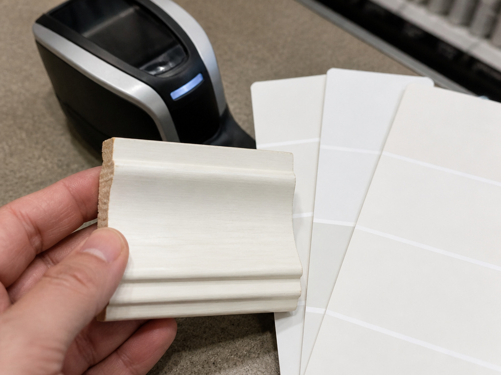
Take a piece of the trim off the wall and carry it to the store, the surest answer to how to choose a trim color that matches wall paint.
Kylie M Interiors is blunt about this one: no eyeball matches. Pull a piece of trim, take it to several paint stores, have each one run a machine match, and go with the brand that gets closest. Tweaking from there is fine. Guessing wastes a gallon.
- Bring actual trim, not a photo. A phone screen lies about white, and it lies differently in every room.
- Try more than one store. Kylie M Interiors suggests several, then picking whichever brand lands nearest.
- Include the permanent finishes. Sherwin-Williams says cabinets, tile, and a brick fireplace belong in the decision, and calls out cabinet wood with a red undertone as something the paint has to work with.
- Match warm to warm. If the trim or cabinets are a warm white you won’t repaint, Kylie M Interiors says the wall white should be warm too.
Better Homes & Gardens adds a temperature rule that lines up with this. Warm, creamy whites complement rich colors and earthy tones, while clear or crisp whites pair well with cool hues.
The full method for matching paint color starts with that removed piece of trim and ends at whichever counter gets closest.
If the trim is stained wood rather than painted, the question changes completely and you’re really picking a wall color that flatters the grain.
Where the Paint Brands Genuinely Disagree
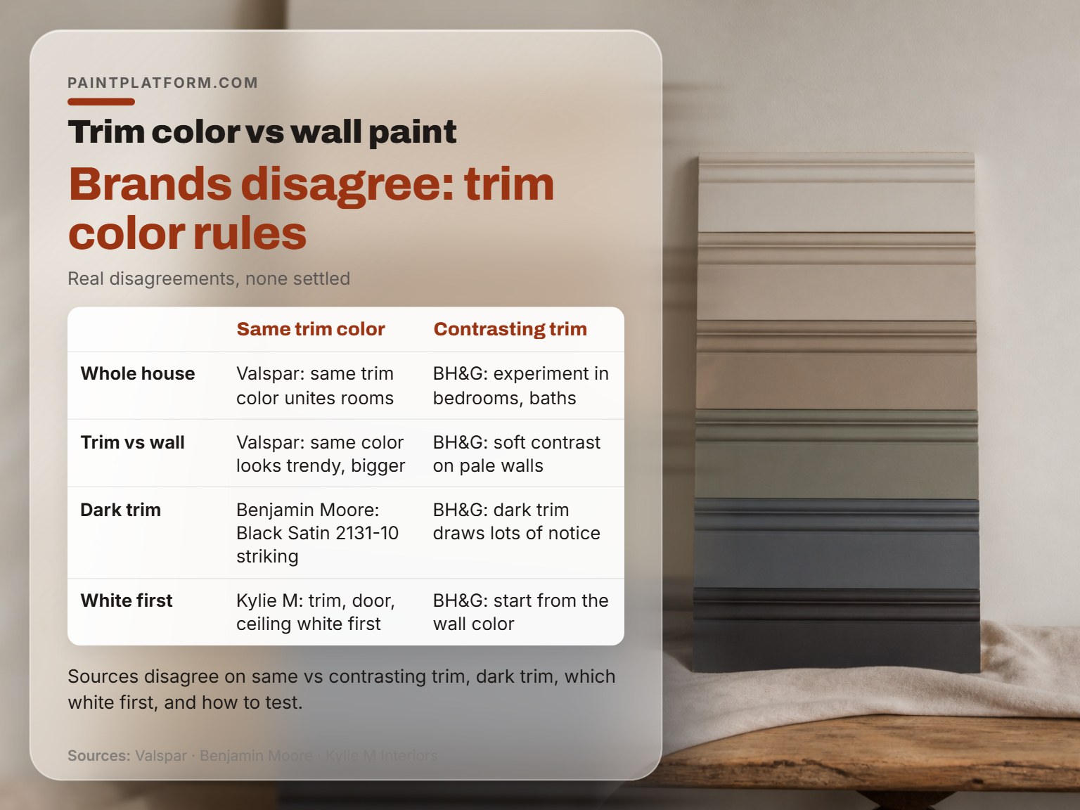
Four real disagreements run through the sources, and none of them is settled.
Same trim color through the whole house
Better Homes & Gardens says use the same trim color through the main areas and experiment in bedrooms and bathrooms. Valspar says the same trim color throughout the whole home unites the rooms. Sherwin-Williams lands close, recommending one neutral color on all trim and doors.
The split is small but real. BH&G hands you permission to break the rule in private spaces. The other two don’t.
Dark trim: feature or gamble
Benjamin Moore promotes Black Satin 2131-10 against a neutral wall as a striking way to showcase architecture. Valspar frames dark trim as the bold option. Better Homes & Gardens treats darker-than-wall trim as an attention device and cautions that dark trim against light walls draws a lot of notice to the woodwork.
Same technique, three confidence levels. Pick your comfort level and stop reading reviews.
Which white gets chosen first
Kylie M Interiors picks the trim, door, and ceiling white first. Better Homes & Gardens starts from the wall color. Sherwin-Williams starts somewhere else again, suggesting you pull shades from a favorite rug, piece of art, or fabric.
All three are in print from credible sources. Pick the one that matches what you’ve already committed to, because each protects a different thing you can’t easily undo.
How to test a sample
| Source | Method | What it catches |
|---|---|---|
| Better Homes & Gardens | Sample quart on a poster board held against the wall | How the two colors sit together |
| Benjamin Moore | Painted foam core board moved around the room | How the color shifts through the day |
| Valspar | Samples painted on the wall, left up a couple of days | The true color under your own light |
| Sherwin-Williams | Swatch on the wall in different lighting and times of day | The day-to-night shift |
The methods don’t fully agree either. Kylie M Interiors wants a machine match for existing trim. Benjamin Moore and Sherwin-Williams both want a visual test in the room. Those answer different questions. The machine match tells you what color you already have. The room test tells you what it will look like once it’s yours.
A trim color you have to talk yourself into is a trim color you’ll repaint. Buy the sample quart, live with the board for a couple of days, and let the room vote.
Testing a Trim Color Without Wasting a Gallon
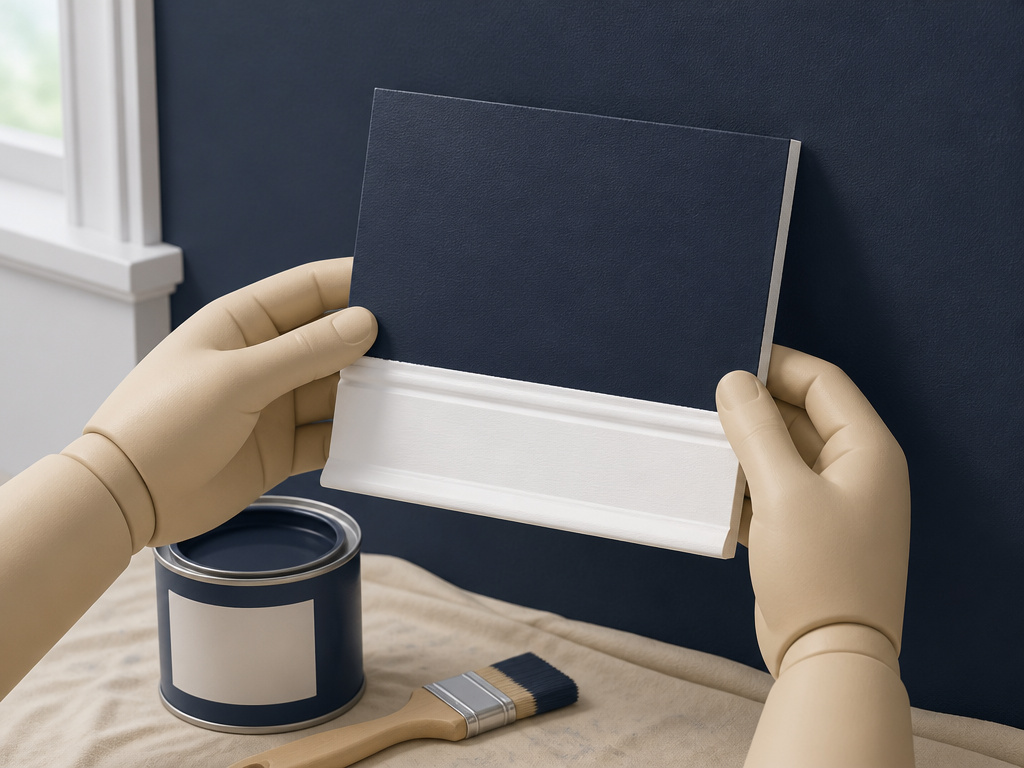
The first time I took a dark navy wall down to a pale color, it took several coats.
That was with no primer. The second time I asked the paint counter to tint a gray primer toward the topcoat color, and the job dropped to a primer coat plus fewer topcoats.
A tinted primer goes on flat and chalky and helps bury the old color. Skip it and the topcoat keeps flashing the old shade through, coat after coat. You’ll smell the fresh paint long before the color settles.
- Buy a sample quart and paint a board. Better Homes & Gardens suggests a poster board positioned against the wall. Benjamin Moore suggests foam core, which is light enough to carry around.
- Move the board through the room. Benjamin Moore wants it in different parts of the room at different times of day.
- Leave it up for a couple of days. Valspar suggests exactly that, looking at the samples through the day in different light.
- Check the light you actually live in. Sherwin-Williams notes the same color looks different at various times of the day and night, and recommends testing a swatch on the wall in different lighting.
Picking a trim white is like seasoning a soup. You add a little, taste, and add more. The beginner move is dumping in the whole jar at once.
I’d rather you spend on a sample quart and a foam board than on a gallon you’ll regret. The board keeps working after the paint dries, and it costs a lot less than starting over.
Fair warning: a board that looks right in daylight can look wrong under a lamp at night. Give yourself permission to experiment before the gallon is open.
Frequently Asked Questions
Should trim and walls be the same white?
They can be, and Kylie M Interiors calls that the easy option when you want white walls with existing white trim. Valspar notes that using the wall color on trim can make a room look bigger. The catch is that the two surfaces carry different sheens, so an exact match on the card can still read as two colors on the wall.
How do I match new trim to trim I’m not repainting?
Pull a piece of the existing trim and take it to a store that uses a color-matching machine. Kylie M Interiors is explicit that eyeball matches fail, and suggests trying several stores before going with whichever brand gets closest. Tweaking the formula afterward is fine as long as the machine match is the starting point.
Can I use wall paint on trim?
You can, and the finish is the reason most people don’t. Better Homes & Gardens recommends semi-gloss or gloss for trim because fingerprints, scuffs, and dirt wipe off far more easily than they do from a flat finish. A matte trim will show every hand that touches it.
What sheen should trim paint be?
Semi-gloss or gloss, according to Better Homes & Gardens, for cleanability and a subtle lift to the trim work. Kylie M Interiors notes that trim is usually satin or semi-gloss while walls are usually matte or eggshell, and that this gap alone changes how a matched white reads.
What if my cabinets are a warm white?
Kylie M Interiors says the wall white should be warm too if you can’t or won’t repaint the cabinets. Sherwin-Williams adds that permanent finishes like cabinets, tile, and a brick fireplace belong in the color decision from the start, and specifically flags cabinet wood with a red undertone as something the paint has to work with.
The Bottom Line
If you only do one thing this week, do this: pull a piece of trim off the wall, take it to a store with a color-matching machine, and get it matched. Then buy a sample quart of the wall white you’re considering and paint it on a foam board. Lean the board against the wall next to the door casing and check it at breakfast and again after dark.
That’s a little work spread over two days, and it beats repainting a hallway.
Here’s the concession. Everything above assumes painted trim. If the woodwork is stained and you’re keeping it, you’re not matching a white at all. You’re picking a wall color that flatters the grain, and Better Homes & Gardens is right to warn that dark stain against light walls pulls the eye straight to the woodwork. Different problem, different rules.
One small stroke at a time. Start with the trim piece in your pocket.
