
How to Paint a Small Room to Make It Look Bigger
This post contains affiliate links. As an Amazon Associate, we earn from qualifying purchases.
To paint a small room to make it look bigger, paint the walls a light color with a high light reflective value, keep the trim close to the wall shade, and pick a satin or pearl sheen. A 2018 study found bright side walls made rooms appear 7.88 cm wider.
That 7.88 cm came from a head-mounted-display experiment with 20 participants, run using unfurnished, windowless, stereoscopic simulations. The effect is real. It is also small, which means the how to paint a small room to make it look bigger advice you have read a hundred times is doing less work than the prep underneath it.
What follows separates the moves with a measurement behind them from the ones that are pure house style, including the places where two paint companies contradict each other outright.
Key Takeaways
- Light walls with an LRV above 65 are Sherwin-Williams’ and Benjamin Moore’s recommendation, though Sherwin-Williams’ own debunking page disputes that light walls make rooms look big.
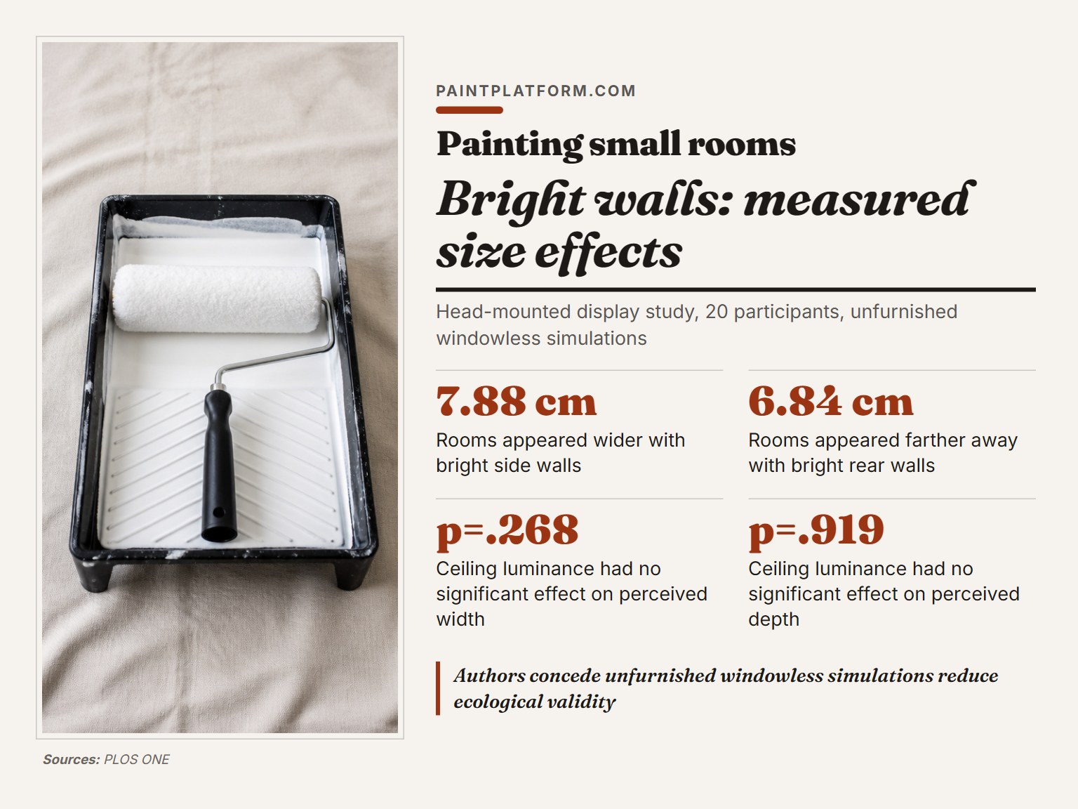
- The measured effect is centimeters. Bright side walls read 7.88 cm wider and bright rear walls 6.84 cm farther in a 2018 PLOS ONE study.
- Ceiling color is the weakest lever in the room. That same study found no significant effect from ceiling luminance on perceived width or depth.
- Higher sheen bounces more light and tends to highlight surface imperfections. Prep the wall first or the sheen will punish you for it.
- Test chips from morning to evening, under both natural and artificial light, before you commit to a color.
What Light Reflective Value Actually Does in a Small Room
Every paint chip carries a number that rarely gets read: light reflective value, or LRV, scored 0 to 100.
Light reflective value, or LRV, is a 0 to 100 scale that paint brands publish alongside each color. Sherwin-Williams sets that 65 threshold for colors the brand calls expansive; Little Greene’s Loft White sits at 92, Gauze at 77, and Flint at 66.
A wall with a high LRV sends more light back at your eye. The surface reads brighter, and the room’s edges feel further out. That is the whole mechanism. Nothing mystical happens when the roller touches the wall.
Here is the part the paint aisle never tells you. The effect is centimeter-scale, not dramatic. The 2018 study by von Castell, Hecht and Oberfeld found bright side walls made a room appear 7.88 cm wider, a result that was statistically significant at F(1,19)=17.85, p<.001. Real, statistically significant, and small.
Choosing paint colors for small spaces gets easier once you know which numbers to look at. Start with LRV, then worry about the shade.
Does a Light Wall Color Really Make a Room Look Bigger?
Sherwin-Williams says yes on one page and no on another.
That is the short version of this entire debate, and it is worth sitting with. The company’s project-center page tells you soft whites, pale grays, and gentle beiges with an LRV above 65 will make a space feel expansive. The company’s own color-education page states there is no scientific paper or study suggesting light walls make rooms big.
Benjamin Moore lands on the yes side, pointing to off-whites, light neutrals, pales, and pastels for the illusion of larger, brighter rooms.
What the Mainz Study Actually Measured
The research both brands keep circling came out of Johannes Gutenberg University in Mainz, Germany, and appeared in the Quarterly Journal of Experimental Psychology in 2010. It used virtual reality apparatus.
The perceptual change based on color varied by just two inches across colors, in a room with an actual height of 10 feet. Strip color out entirely and people overestimated ceiling height by an average of eight inches when you compare a how to paint a small room to make it look bigger.
That last number reframes the whole argument. Human beings are already shaky at judging room size before a single coat goes on.
| Claim | Backed by | Pushed back on by |
|---|---|---|
| Light walls make a room look bigger | Sherwin-Williams project page (LRV above 65); Benjamin Moore | Sherwin-Williams’ own debunking page |
| A darker far wall creates depth | Sherwin-Williams; Little Greene | von Castell 2018: bright rear walls read 6.84 cm farther |
| Ceiling color changes perceived size | Sherwin-Williams; Benjamin Moore | von Castell 2018: no significant effect (p=.268, p=.919) |
| Higher sheen makes a room feel larger | Sherwin-Williams; Benjamin Moore; Little Greene | Nobody, but high sheen exposes every flaw |
So what do you do with a contradiction? Sherwin-Williams’ project page and Benjamin Moore recommend light walls, while Sherwin-Williams’ own debunking page disputes the effect; the advice costs little, but the evidence is contested. Just don’t expect it to buy you a bigger room.
White is the hardest color to get right here, which is why best white paint for interior walls is a longer conversation than it sounds.
Where the Dark Far Wall Rule Breaks Down
Sherwin-Williams recommends painting the far wall a slightly darker, complementary shade to create depth. Little Greene makes a related case from the other end: dark rich colors like Hicks’ Blue, Dark Lead Colour, and Puck create what the brand calls bottomless depth, making a wall seem further away.
The 2018 study points somewhere else entirely. Bright rear walls made rooms appear farther away, by 6.84 cm, significant at F(1,19)=7.52, p=.013, though Sherwin-Williams and Little Greene still recommend darker far walls for depth.
Three positions, all defensible, all different:
- Sherwin-Williams: slightly darker far wall, subtle contrast, cohesive flow.
- Little Greene: genuinely dark, saturated color for a wall that recedes into depth.
- The measured finding: a bright rear wall reads as further away, which is the opposite of both.
The Contrast Finding Nobody Quotes
The study authors state plainly that their data do not support the common designer guideline that luminance contrast between bounding and surrounding surfaces amplifies the size effect. They found the opposite interaction direction.
That matters because contrast is the engine behind the darker-far-wall recommendation, though Sherwin-Williams and Little Greene still recommend it; the study’s data do not support contrast amplification.
Where this goes sideways: Painting the far wall dark and leaving the other three bright white. The contrast pulls your eye straight to the back wall, which is the opposite of what a small room needs. Sherwin-Williams recommends a consistent color story and warns that sharp contrasts break a space up.
My read on it: a dark far wall is a real design move, but it is a focal-point move, not a size move. The two get conflated constantly. If you want that wall darker, do it deliberately, the way you would approach painting an accent wall, and accept that you are buying drama rather than square footage.
The peer-reviewed interior space perception study behind that 6.84 cm figure is short and readable, and worth an hour if you want to see how the measurement was actually done.
Does Painting the Ceiling Lighter Actually Add Height?
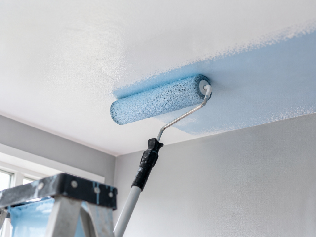
Sherwin-Williams says paint the ceiling a shade lighter than the walls to draw the eye upward. Benjamin Moore recommends a light shade of blue, Smoke 2122-40, on the ceiling in dimmer spaces.
The 2018 data found no significant effect from ceiling luminance on perceived width (p=.268) or perceived depth (p=.919). Worth being precise here: that study measured width and depth, not height. The height question belongs to the older Mainz work, and the debunking page calls those findings mixed and inconclusive. Observers said the light room seemed tallest, but a dark room also appeared taller than a medium one.
A ceiling you painted lighter is a guess. A wall you sanded flat is a fact.
If you like a pale ceiling, paint one. The cost is a gallon and an afternoon, and the evidence neither supports nor forbids it. For rooms that never see direct sun, the best paint colors for low light rooms question will change your result far more than the ceiling ever will.
Sheen, Curtains, and the Light You Actually Live With
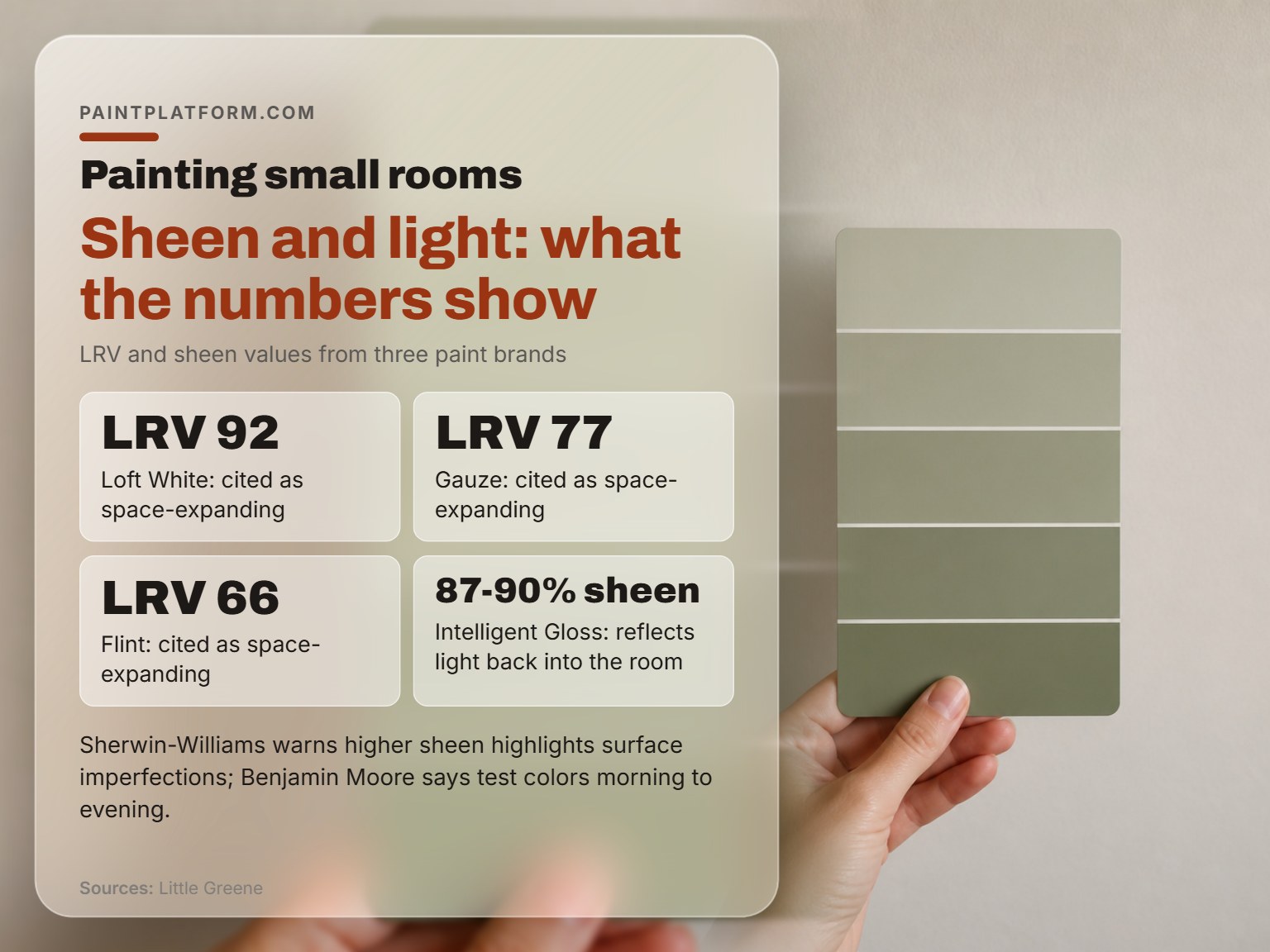
All three brands recommend a higher sheen, though Sherwin-Williams warns higher-sheen paints highlight surface imperfections. Sherwin-Williams points to pearl or satin. Benjamin Moore says semi- or high-gloss, because higher sheens are more reflective. Little Greene publishes exact numbers.
Sherwin-Williams adds the warning that matters more than the recommendation: higher-sheen paints tend to highlight surface imperfections.
Stand in the doorway in the morning and again in the evening and the same chip reads two different colors. That is not your eyes playing tricks. It is why Benjamin Moore tells you to test colors from morning to evening under both natural and artificial light.
| Color or finish | Measured value | Where it earns its place |
|---|---|---|
| Sherwin-Williams “expansive” cutoff | LRV above 65 | The brand’s own bright-wall threshold |
| Loft White (Little Greene) | LRV 92 | Rooms that need maximum bounce |
| Gauze (Little Greene) | LRV 77 | Pale walls, softer than Loft White |
| Flint (Little Greene) | LRV 66 | Just clears the 65 line |
| Intelligent Gloss (Little Greene) | 87-90% sheen | Trim, frames, banisters |
| Intelligent Satin (Little Greene) | 30-35% sheen | Walls that want some reflection |
Cool White vs Warm White
Sherwin-Williams notes that cool white lighting makes spaces feel expansive and airy, similar to natural daylight. Warm lighting creates a cozy atmosphere, making a room feel more intimate and potentially smaller.
The non-paint moves that shift a room fastest:
- Sheer curtains let natural light through and make a room appear larger.
-
Light-filtering or blackout curtains can shrink a room, unless you hang them above the window, where they draw the eye upward instead.
-
Smart bulbs or a dimmer let you run cool and bright in the morning, warm and low at night.
Sheen and light both change what a color does, which is why choosing paint colors in a small room is a different exercise than picking a favorite.
Prep Decides Everything, and Nobody Wants to Hear It
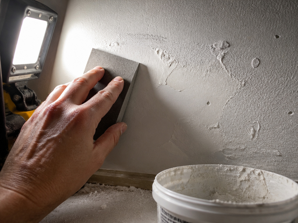
A bright work light held at a grazing angle is the most useful tool in this entire job. Shine it sideways across the wall and every dent, every ridge of old patch, every streak of dust shows up as a hard shadow. It looks terrible. That is the point.
I learned that the slow way, on a bedroom wall I had already rolled twice. Under normal light it looked fine. Under the raking light from the hallway it looked like a relief map, and by then the paint was dry.
The Raking Light Check
Run your palm across the surface too. A patch that sits proud of the drywall feels like a hard little lip under your hand, and no amount of paint will bury it. Paint builds on the high spot and pools around the edge, so the flaw gets more obvious with each coat.
I won’t roll a wall until I’ve looked at it with a light held sideways. It’s a two-minute check that saves an entire repaint, and it’s the step I skipped for years because it felt like overkill.
A tub of spackling and a sanding sponge handle most of what the light finds. Sanding matters more than filling: a filled dent that is not feathered flat still reads as a bump once the sheen goes up.
Common mistake: Painting over dust and small dents. They vanish while the paint is wet and reappear as shadows the day it dries.
How to Paint a Small Room to Make It Look Bigger, Step by Step
Before you start: Fumes concentrate fast in a small room with the door shut. Open a window and set a fan to push air out of the room, not just stir it around. Keep oil-based primer and paint away from pilot lights and water heaters, and don’t sleep in the room until the smell clears.
- Clear the room and wash the walls. Grease and dust stop paint bonding, and a missed patch of kitchen grease shows as a dull ring through two coats.
- Find the flaws with a raking light. Skip this and every dent becomes a shadow the moment the sheen goes up.
- Fill, then sand flat. Sanding matters more than filling. A proud patch that is not feathered still reads as a bump under a window.
- Prime the patches. Bare spackle drinks paint differently than drywall paper, so unprimed patches dry to a different sheen and show as flat spots.
- Cut in the ceiling line and corners first, then roll. Rolling into wet cut-in lines leaves a texture ridge that catches light from across the room.
- Roll in a W, keep a wet edge, and stop. Over-rolling flashes when the paint starts to set, and a flashed wall looks patchy under a window.
If you want the whole job done in one push, paint a room in one day is doable on a small space, provided the prep happened the day before. And run the how much paint numbers before you leave the store, because a half-gallon short in the middle of a wall is its own kind of grief.
Frequently Asked Questions
What color makes a small room look biggest?
Any color with an LRV above 65 does the same job, which is why soft whites, pale grays, and gentle beiges dominate the advice. Little Greene’s Loft White sits at LRV 92 and Gauze at 77. Benjamin Moore points to off-whites, light neutrals, pales, and pastels. The exact hue matters less than the reflectivity.
Does painting the ceiling white make a room look taller?
The evidence is weaker than the advice suggests. A 2018 PLOS ONE study found ceiling luminance had no significant effect on perceived width or depth, though it did not measure height. The older Mainz work on height produced mixed results that the researchers themselves called inconclusive. Paint the ceiling pale if you like how it looks.
Is matte or satin better for a small room?
Satin reflects more light, and all three major brands recommend a higher sheen for that reason. Sherwin-Williams warns that higher-sheen paints highlight surface imperfections, so the honest answer is satin on a well-prepped wall and matte on a wall you would rather not inspect closely.
Do dark colors make a small room look smaller?
Not reliably. Sherwin-Williams’ own color-education page states there is no scientific paper supporting the idea that warm colors shrink rooms, and Little Greene argues that dark rich colors create depth. A dark wall reads as a focal point, which is a design decision rather than a size penalty.
How many coats do I need?
Prime the patches first, because bare spackle and drywall paper absorb paint at different rates. Priming the patches first saves you a coat, because bare spackle and drywall paper absorb paint at different rates.
The Bottom Line
Buy the work light before you buy the paint. That single change will do more for how your room looks than any color decision on this page, and it costs less than a gallon.
Here is the threshold I would actually use. If your walls have more than a couple of visible dents, or a patch that catches your fingernail when you run a hand across it, spend the weekend on prep and buy the cheaper paint. Expensive paint over a flawed wall is money spent hiding a problem that spackle would have solved.
And a concession, because this advice does not survive every situation. If you rent, and spackling is off the table, everything above collapses to one move: pick a color above LRV 65, paint the trim the same shade, and live with the dents. The room will still read brighter, and you will get your deposit back.
